Summary
Vilhelm Lundstrøm (1893–1950) is one of Denmark’s foremost modernists, known for his rigorous compositions against blue backgrounds. But how did Lundstrøm work his way towards each finished image? And did he favour one particular blue pigment? These questions formed the point of departure for Kunstmuseum Brandts’ exhibition Lundstrøms evighedsblå / Lundstrøm’s Eternal Blue (May 2024 – March 2025). Thanks to an interdisciplinary collaboration with scholars and researchers from the University of Southern Denmark (SDU), Konserveringscenter Vejle and Newtec Engineering, the exhibition was able to present the results of the most extensive scientific analyses to date of Lundstrøm’s working process and use of blue pigments. Despite conducting careful preparatory work, Lundstrøm often made numerous changes to his paintings before arriving at the final image. He also experimented with blue colours throughout his career. This long process of working with colour and subject matter lies concealed beneath layer upon layer of paint and has only truly been brought to light with the exhibition Lundstrøm’s Eternal Blue.
Articles
Introduction
The exhibition Lundstrøm’s Eternal Blue at Kunstmuseum Brandts was conceived as a small, collection-based exhibition which, taking as its point of departure the museum’s eleven paintings by Lundstrøm from the period 1918 to 1945, would focus on the artist’s recurrent use of the colour blue, which he reportedly referred to as “eternal blue”.1
The concept of Lundstrøm’s eternal blue has previously been explored by the art historian Liza Kaaring, who, on the basis of pigment analyses, demonstrated that Lundstrøm’s eternal blue cannot be firmly linked to any one particular blue pigment. She also showed that Lundstrøm’s characteristic blue backgrounds are often complex structures built up from several layers of paint.2 In the course of preparing the exhibition, Kunstmuseum Brandts had the opportunity to build on Kaaring’s investigations through the research project TORCH.3 The collaboration with TORCH partners from the Mads Clausen Institute at SDU, Konserveringscenter Vejle and the company Newtec Engineering in Odense resulted in the most extensive scientific analyses to date of Lundstrøm’s use of blue pigments. In addition, the investigations shed light on Lundstrøm’s working process, which became a new focal point in the exhibition at Kunstmuseum Brandts. This article presents the most significant findings from the research collaboration.
Striving for ‘perfect beauty’
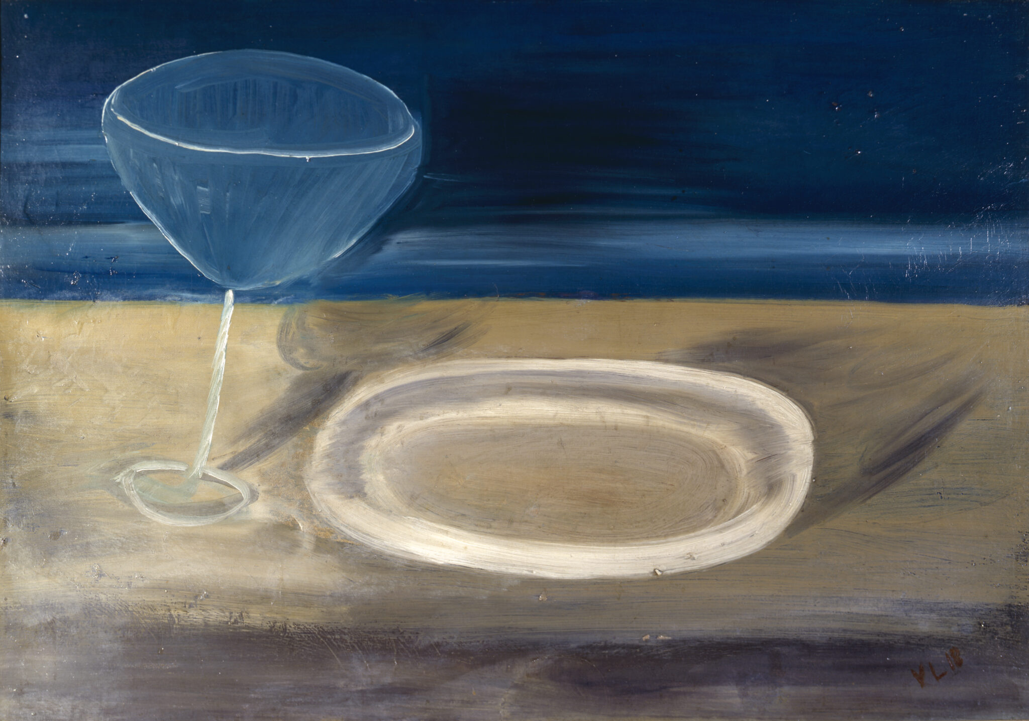
Vilhelm Lundstrøm (1893–1950) is one of the most important Danish modernists of the twentieth century. He made his breakthrough at Kunstnernes Efterårsudstilling (The Artists’ Autumn Exhibition) in Copenhagen in 1917, where he exhibited a number of Cubist collages. The following year he introduced montage to the Danish art scene with his so-called crate pictures – a series of reliefs that united painting and sculpture.4 In the years that followed, Lundstrøm painted a series of still lifes and figure paintings which, with their spontaneous, rough brushwork, became known as his ‘curly’ works.5 Lundstrøm subsequently moved towards an increasingly pared-back pictorial language which, from the mid-1920s, culminated in a series of monumental still lifes and figure paintings with striking blue backgrounds. Their idiom corresponds to that of French Purism; an aesthetic movement which – in the years after the First World War, and under the leadership of the Swiss-born architect, painter, draughtsman and sculptor Charles-Édouard Jeanneret-Gris, known as Le Corbusier (1887–1965), and his cousin, the French painter Amédée Ozenfant (1886–1966) – advocated a purified, formal aesthetic based on mathematical principles.6 In keeping with this, Lundstrøm made the following statement in an interview in 1939: ‘We strove to work our way towards simplicity and painterly order, and we also believed that by this route we could approach a kind of ultimate and perfect beauty.’7 It is in Lundstrøm’s Purist-inspired paintings from the 1920s and 30s that we find his most striking blue backgrounds. From the mid-1930s until his death in 1950, Lundstrøm allowed the illusion of a true pictorial space to recede in favour of a greater focus on colour. Blue no longer played the leading role. Instead, it entered his figure paintings and still lifes on an equal footing with other colours.
In 1933, the art history scholar Poul Uttenreiter wrote the following on Lundstrøm’s pronounced striving for formal harmony: ‘A distinctive and characteristic feature of his art lies in the fact that, in certain paintings, one can see how, after the picture was ostensibly finished, he has – dissatisfied with its balance – with a firm and unhesitating hand painted over a strip of a jar, moving it further towards one side of the picture. He is unafraid to let the form of the jug become distorted if only he succeeds in giving it its entirely correct position and breadth. The overall impression is akin to infinitesimal displacements within a system of levers, and it is clear that a desire for spiritual clarity and certainty seeks expression in these formal shifts – adjustments that may call to mind the transposition of mathematical terms from one side of an equation to the other.’8 Here, Uttenreiter points to Lundstrøm’s mathematically precise sense of composition, which is also found in the ideology of Purism. Nevertheless, Lundstrøm has been regarded as a painter who, while undoubtedly striving for compositional balance, worked spontaneously with the material substance of painting. Thus, in 2017, the architectural historian Carsten Thau wrote: ‘Unlike Le Corbusier, Lundstrøm does not cultivate numerical or mathematical ideals; as a rule, he works intuitively with his compositions, adjusting the position of objects during the creative process.’9 As this article shows, Thau is very much correct in asserting that Lundstrøm worked intuitively during the creative process of his paintings. At the same time, however, the hyperspectral images we have taken of two of Lundstrøm’s paintings in the collection of Kunstmuseum Brandts reveal hidden, systematic underdrawings, showing that – in these two examples, at least – he began his works more methodically than has previously been assumed.
Blue pigments in Lundstrøm’s day
In Lundstrøm’s day, the commonly used blue pigments were manufactured synthetically and sold as paints in tubes. The most widespread blue pigment was ultramarine – a sodium aluminium sulfosilicate. The pigment was first produced synthetically in 1828, thereby changing from one of the most exclusive and expensive pigments, extracted from the semi-precious stone lapis lazuli, into one of the cheapest and most widely used in the painter’s trade.10 Ultramarine could now be used in large quantities, including for sky-blue ceilings in churches and other buildings, and from the mid-nineteenth century onwards ultramarine was used for this type of decoration as never before.11 The popularity of ultramarine in interiors remained widespread in Lundstrøm’s time, and several artists’ homes of the period had rooms with walls in strong ultramarine blue.12
Another widely used blue pigment at the time was Prussian blue (Fe4(Fe(CN)6)3), which became commercially available from the mid-1720s onwards. The chemical compound can vary, especially in the early types, when the manufacturing process was not yet fully controlled.13 Prussian blue has such a high tinting strength and tends so strongly toward black that the pigment is mixed with white pigments to avoid appearing black.14 The pigment is also known by names such as Berlin blue, Paris blue and Brandenburg blue.15
Whereas ultramarine and Prussian blue were relatively inexpensive pigments, the situation was quite different for cobalt blue (CoO·Al₂O₃). The pigment came onto the market at the beginning of the nineteenth century and was much loved for its clear blue colour, but because cobalt blue was among the most expensive pigments available, it was scarcely used outside the artistic profession.16 A notable exception in Denmark was observed when the Danish architect Carl Petersen (1874–1923) used cobalt blue for the walls of the domed hall at Faaborg Museum (1915); it was by far the most expensive pigment used in the museum’s decoration.17 Other pigments that contained cobalt and were in use at the time included cerulean blue (Co2SnO4·Mg2SnO4), sold as an artists’ colour from the 1860s onwards, as well as the blue-green pigment cobalt chromite blue (CrCoAl3O7).18
During Lundstrøm’s working life, a new pigment began to be manufactured which, in the years after his death, would become the most widespread of all blue pigments: the synthetic organic pigment copper phthalocyanine blue, hereafter referred to as PB15 after its generic name in the Colour Index.19 The pigment became commercially available from the mid-1930s onwards and was introduced relatively quickly as an artists’ pigment, sold under names such as Monastral blue or – misleadingly – as cerulean blue or indigo.20 The pigment’s tinting strength is more than twice as strong as that of Prussian blue and twenty to thirty times stronger than that of ultramarine, which is why PB15 is used with a large proportion of fillers and/or white pigments.21
Methods used
In the following, we briefly account for the methods we have used to analyse Lundstrøm’s painting technique and blue pigments:
Paint cross-sections: A painting is built up of several layers: the canvas is the supporting substrate, which is typically prepared with a white ground, followed by one or more paint layers and, in some cases, a final layer of varnish. The stratigraphy of the paintings was analysed by taking samples, which were embedded in epoxy and polished flat.22 Paint cross-sections make it possible to closely examine and analyse the pigments in the individual layers under the microscope. Lundstrøm used oil paint23 for his paintings, a technique that enabled him to build up the surface with several layers of paint. Six paint cross-sections were taken from four paintings whose thickly painted surfaces suggested a build-up of numerous layers: Nature morte (1923–25), Still Life with Fruit (c. 1925), Model (1941) and Nature morte (1945).
Analyses of the paint cross-sections were carried out using Raman spectroscopy and SEM-EDX (scanning electron microscopy–energy-dispersive X-ray spectroscopy), as discussed below.
Elemental analysis using XRF (X-ray fluorescence)24 and SEM-EDX:25 Both methods use X-radiation to determine the elements present in a material. XRF analyses the surface without the need for sampling, while SEM-EDX is used for microscopic analyses. The methods are well suited to most blue pigments that contain metal. If cobalt is identified in a layer of blue, this indicates the use of cobalt blue. If tin is also present, it indicates cerulean blue. If iron is identified, this is a good indication of Prussian blue. XRF is less sensitive to light elements than SEM-EDX and is best suited to heavier elements, which can make it difficult to identify ultramarine, as this consists primarily of light elements. Neither method is well suited to identifying PB15, since the proportion of copper in the pigment is small and the pigment is generally present in extremely small quantities in relation to the amount of filler.
Raman spectroscopy: This method provides information about the chemical composition of materials and is used to analyse individual pigments under a microscope.26 The method is suitable for identifying most blue pigments, though not cobalt blue, whose signals are weak in Raman spectroscopy. By contrast, PB15 produces strong signals, and Raman spectroscopy can detect PB15 even in very small quantities.27
Fourier-transform infrared (FTIR) spectroscopy:28 This method analyses small samples taken from the surface of the paint layer. Like Raman spectroscopy, FTIR provides information about the chemical composition of a material and is well suited to identifying Prussian blue and ultramarine, but cannot detect cobalt blue or cerulean blue. The method can often identify the binding medium in a sample.
X-radiography:29 X-radiographs are used to obtain information about pentimenti (changes made by the artist during the working process) hidden beneath the surface of a painting. Paint layers containing high-density pigments absorb X-radiation strongly and appear lighter in the radiograph than paint layers of the same thickness containing low-density pigments, which allow X-radiation to pass through to a greater extent. White pigments such as lead white and zinc white have a higher density than blue pigments such as ultramarine and Prussian blue. If a white or light-coloured image or detail is painted over in blue, that detail will typically appear clearly in an X-radiograph. The reverse, however, is not the case.
Hyperspectral imaging:30 This method exploits the fact that pigments absorb and transmit radiation differently at different wavelengths, using this characteristic to infer the pigment composition of the painting or changes made beneath its surface during the creative process. In particular, the infrared (IR) range, that is, wavelengths above 700 nm, is used to obtain information about underdrawings or sketches beneath the paint layer. Most pigments are transparent to IR radiation, with the exception of pigments based on the element carbon. Underdrawings in carbon-based graphite and charcoal can therefore be made visible beneath paint layers that are opaque to the naked eye, but transparent to IR radiation.31 Contrasts in the IR images can be enhanced by generating an infrared false-colour image (IRFC). This is done by combining, in a single image, several recordings at different wavelengths, primarily from the infrared range.
Spectral unmixing: This method is based on a model that describes how pigments interact with light while also using measured reference pigment spectra as the basis for the analysis. In hyperspectral images, each measured spectrum typically consists of a mixture of several pigments in different quantities. By comparing these mixed spectra with the reference spectra, the unmixing model attempts to break down the combined spectrum into its pure pigment spectra and estimate their relative contributions. When this analysis is carried out for all spectra in a hyperspectral image, the results can be visualised as so-called abundance maps, which show the distribution of each pigment across the entire image.
Pigment analyses of Lundstrøm’s blues
Lundstrøm’s eternal blue has previously been investigated by Liza Kaaring, who took as her point of departure paintings from Statens Museum for Kunst (SMK). Kaaring showed that Lundstrøm often spent a long time working on the blue background. A paint cross-section taken from SMK’s Female Model (1930) revealed that the background was built up of fourteen layers in different shades of blue, testifying to persistent experimentation during the painting process.32 A visual comparison of his works showed that no two backgrounds are alike, and Kaaring therefore concludes that Lundstrøm’s eternal blue cannot be traced to a single specific blue pigment. This was supported by technical analyses of the paintings Female Model (1930) and Still Life with White Jar, Orange and Book (1932–33), which showed that Lundstrøm had used Prussian blue in the former and cobalt blue in the latter. In other words, the construction of the blue background colour never became routine.33
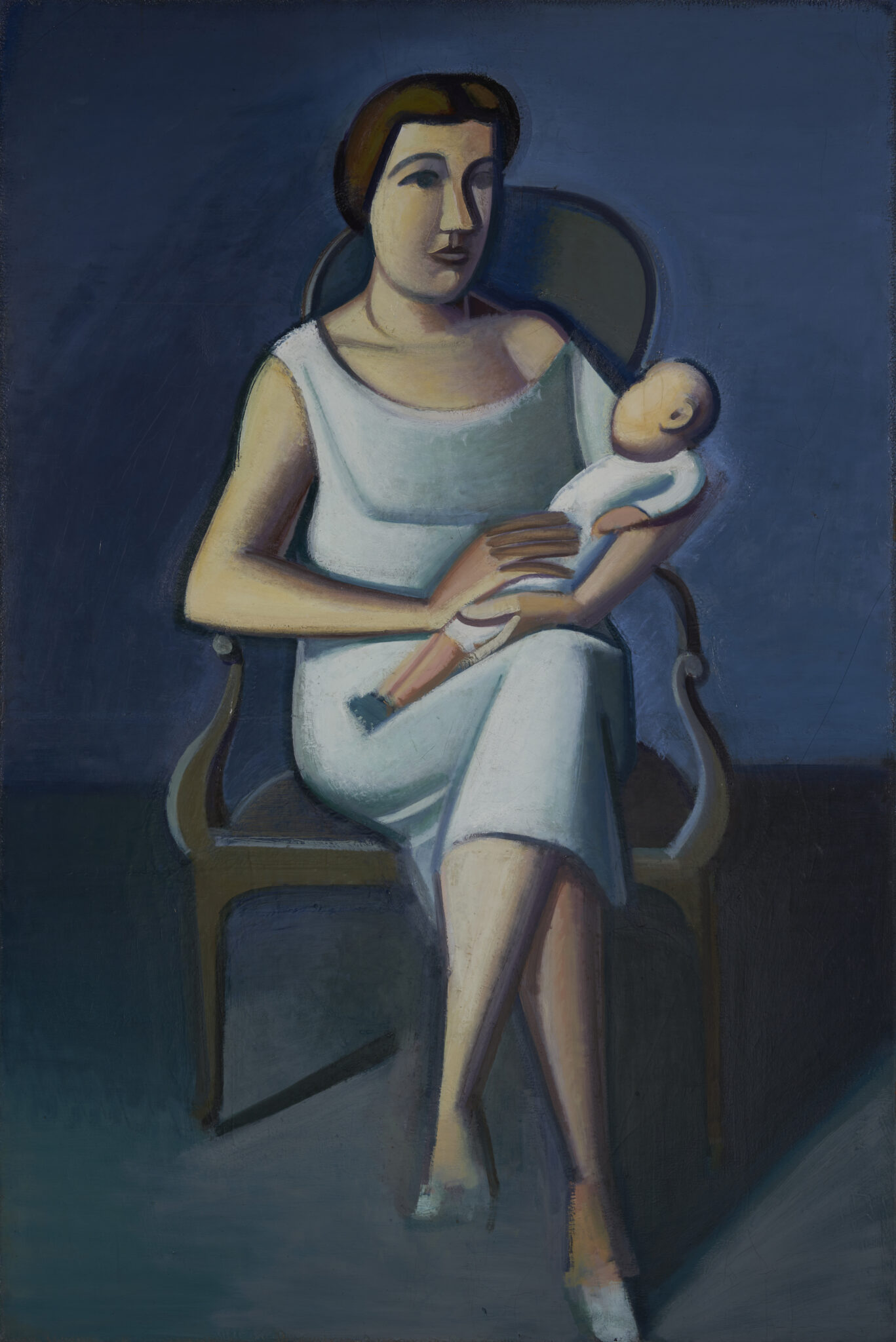
Our investigations of Lundstrøm’s blues confirm and expand on Kaaring’s findings. A visual assessment of the blue backgrounds in Kunstmuseum Brandts’ eleven paintings confirms Kaaring’s assumption that there is variation from one work to the next. In some works, the blue pictorial space is shaped by light and shadow, most markedly in Still Life (1918) [Fig. 1] and Mother and Child (1929) [Fig. 2], whereas the objects in Still Life with Jugs (1930–32) [Fig. 10a] seem rather to hover weightlessly against the painting’s blue background. In some paintings, the background is built up of numerous layers of colour (Mother and Child, Still Life with Fruit (c. 1925) [Fig. 5a]).34 In other paintings, the background is painted comparatively simply, consisting of only one or a few paint layers (Model (1928–29) [Fig. 9a], Still Life with Jugs [Fig. 10a]).
The results of the pigment analyses also reveal considerable variation in the blue pigment compositions of the eleven paintings, summarised in Tables 1 and 2. Ultramarine is the most frequently used of the blue pigments and was identified in ten paintings, Prussian blue in eight paintings, cobalt blue in four paintings and the modern synthetic pigment PB15 in the two latest paintings. Lundstrøm would typically use several types of blue pigment in the same painting, and in only two paintings did he prefer one particular blue: in Still Life from 1918, only Prussian blue was identified, while in Still Life with Jugs only ultramarine was found.35 The results of the paint cross-section analyses presented in Table 2 show that different blue pigments may be mixed in the same layer, or that different blues may have been used in separate layers throughout the stratigraphy of the paint layers [Figs. 4b–7b and Table 2].
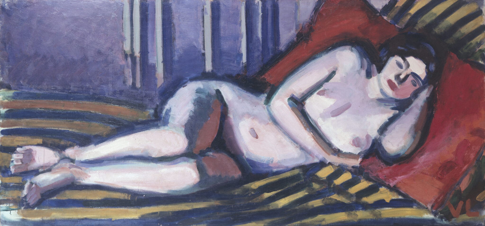
Different types of blue pigment in the same layer need not necessarily be the result of the artist’s own mixing. In the work Reclining Model (1921) [Fig. 3], the blue used in the stripes of the rug appears visually homogeneous in all the brushstrokes and is therefore presumed to have been taken directly from the tube. Several point analyses using FTIR and XRF identified a mixture of cobalt blue and ultramarine in the stripes. The blue colour was probably sold as cobalt blue but mixed with ultramarine by the manufacturer in order to make it cheaper.36
In the museum’s two latest works by Lundstrøm, from 1941 and 1945 respectively, the new blue pigment PB15 appears. The pigment first came onto the market in the mid-1930s and was introduced relatively quickly as an artists’ colour by the English firm Winsor & Newton in 1937 and by the Dutch company Talens in 1940.37 The earliest known example of an artwork in which the pigment has been identified is René Magritte’s painting La Lampe philosophique from 1936.38 The discovery of this pigment in a Lundstrøm painting from 1941 indicates that it was introduced as an artists’ pigment in Denmark at a relatively early stage, and that Lundstrøm was unafraid to make use of new blue pigments. Once again, this confirms Kaaring’s assumption that Lundstrøm’s work with the colour blue never became routine.
![Fig. 4b. Farvesnit fra Nature morte [fig.4a]. Tal i farvesnittene angiver analysepunkter, se tabel 2.](https://www.perspectivejournal.dk/wp-content/uploads/2026/07/Fig.4b.jpg)
Colour experiments beneath the surface
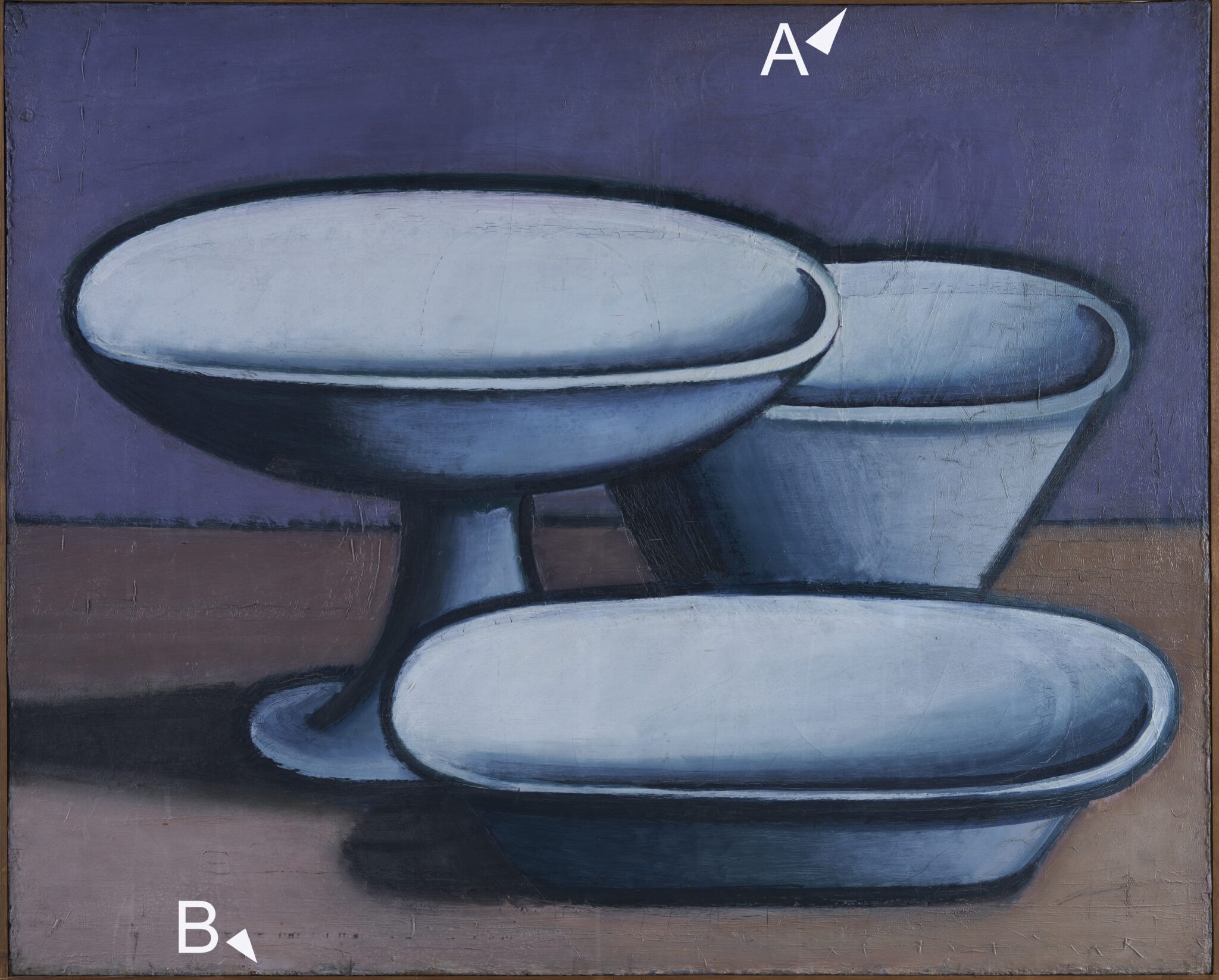
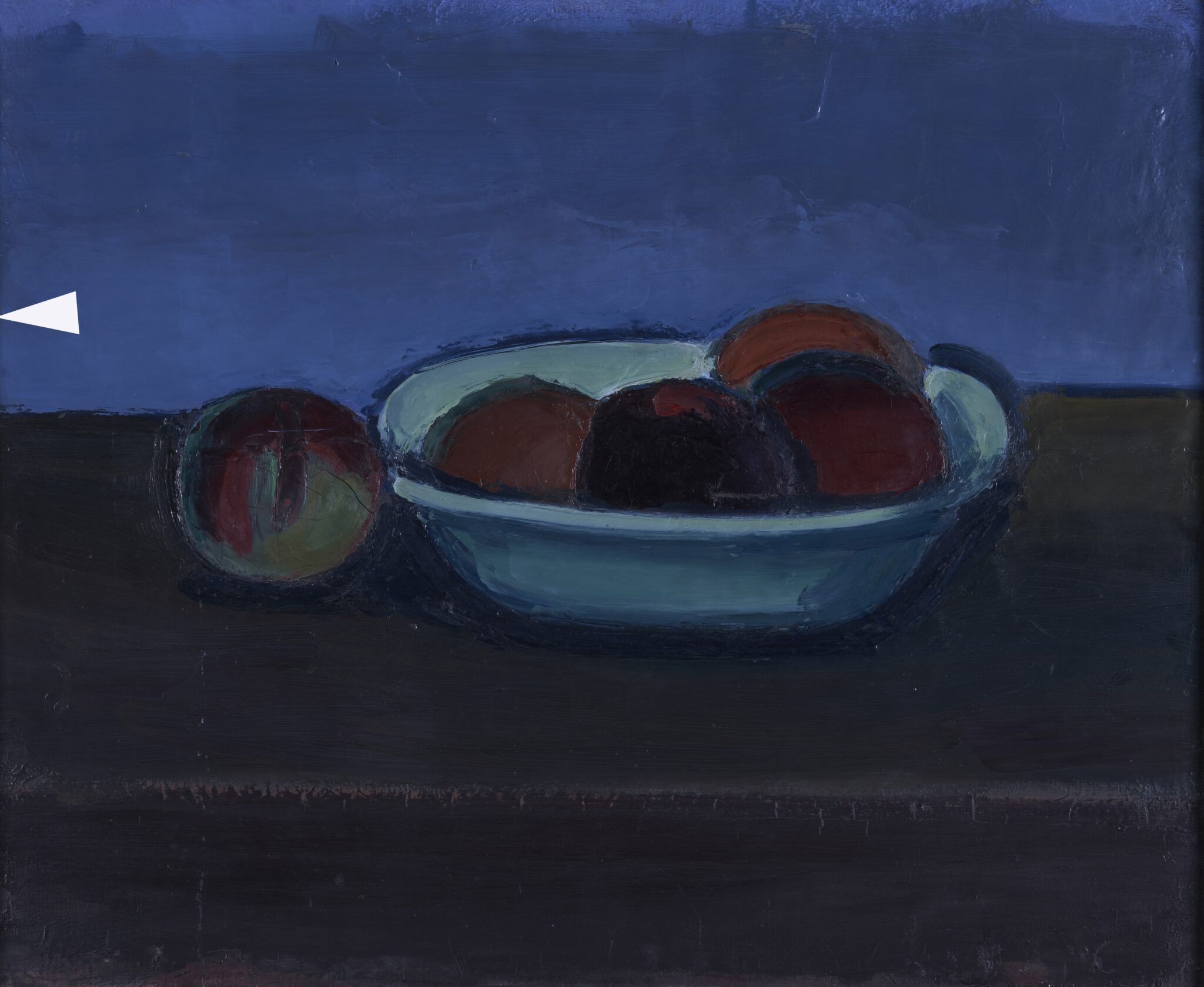
Kunstmuseum Brandts’ collection of Lundstrøm paintings includes examples in which Lundstrøm built up the motif with rapid brushstrokes, and where the painting must have been completed within a few hours (Reclining Model [Fig. 3]), but also paintings in which he made many repeated changes. Paint cross-sections were taken from four paintings of the latter type in order to gain an idea of the structure of their layers [Figs. 4–7], Table 2. The greatest number of paint layers was identified in the two cross-sections from the painting Nature morte (1945), with twenty-six and thirty-two layers respectively in the samples taken, followed by Nature morte (1923–25), with twenty-four layers in both cross-sections. Cross-section B, taken from the tabletop at the bottom, was not complete, meaning that this area is in fact built up of significantly more layers than can be observed in the cross-section. Fewer layers were identified in the cross-sections from the other two paintings: around ten in the cross-section from Still Life with Fruit (c. 1925) and eight in the cross-section from Model (1941).
![Fig. 5b. Farvesnit fra Opstilling med frugter [fig.5a]. Tal i farvesnittet angiver analysepunkter, se tabel 2.](https://www.perspectivejournal.dk/wp-content/uploads/2026/07/Fig.5b.jpg)
In several of the cross-sections, the layers are of different colours, some of which differ markedly from the final, uppermost layer. Some of the individual layers in the cross-sections are thick and were probably opaque. Others are thin and may be assumed to have been semi-transparent in nature, acting as washes or glazes. Some layers are sharply separated, showing that they were applied with sufficient drying time between them [Figs. 4b and 6b], while other layers have been torn up because they never had time to dry before new ones were applied [Fig. 7bA]. The many layers in the cross-sections show that Lundstrøm altered the colour countless times before settling on a final solution. The cross-sections were taken from both early and late paintings by Lundstrøm, indicating that he experimented with the structure of the paint layers throughout his career.
Having said that, a clear shift can be observed in the way Lundstrøm experimented with colour from the mid-1930s onwards, when he moved away from the monochrome background and began breaking it up into fields of colour. Looking at the paintings from this last period of his career, one sees that he actively used the layers immediately beneath the surface to shine through, lending movement and depth to the final layer [Figs. 6a and 7a]. In previous works the background is more uniform in expression. The cross-sections from this final period are distinctive in that they reveal colours beneath the surface that are often represented elsewhere in the painting [Figs. 6b and 7b]. For example, in cross-section A from Nature morte (1945), a brown, pink and turquoise layer can be seen beneath the blue surface, and these colours recur in other areas of the painting. In cross-section B, taken from a pale-blue area at the lower right, a thin layer of orange is visible in the middle of the cross-section, and this reappears in the oranges depicted higher up in the picture plane [Figs. 7a and 7b]. The observations from the cross-sections, considered alongside the visual assessments of paintings from this period, suggest that Lundstrøm actively used colour during the process as a means of arriving at the final composition.
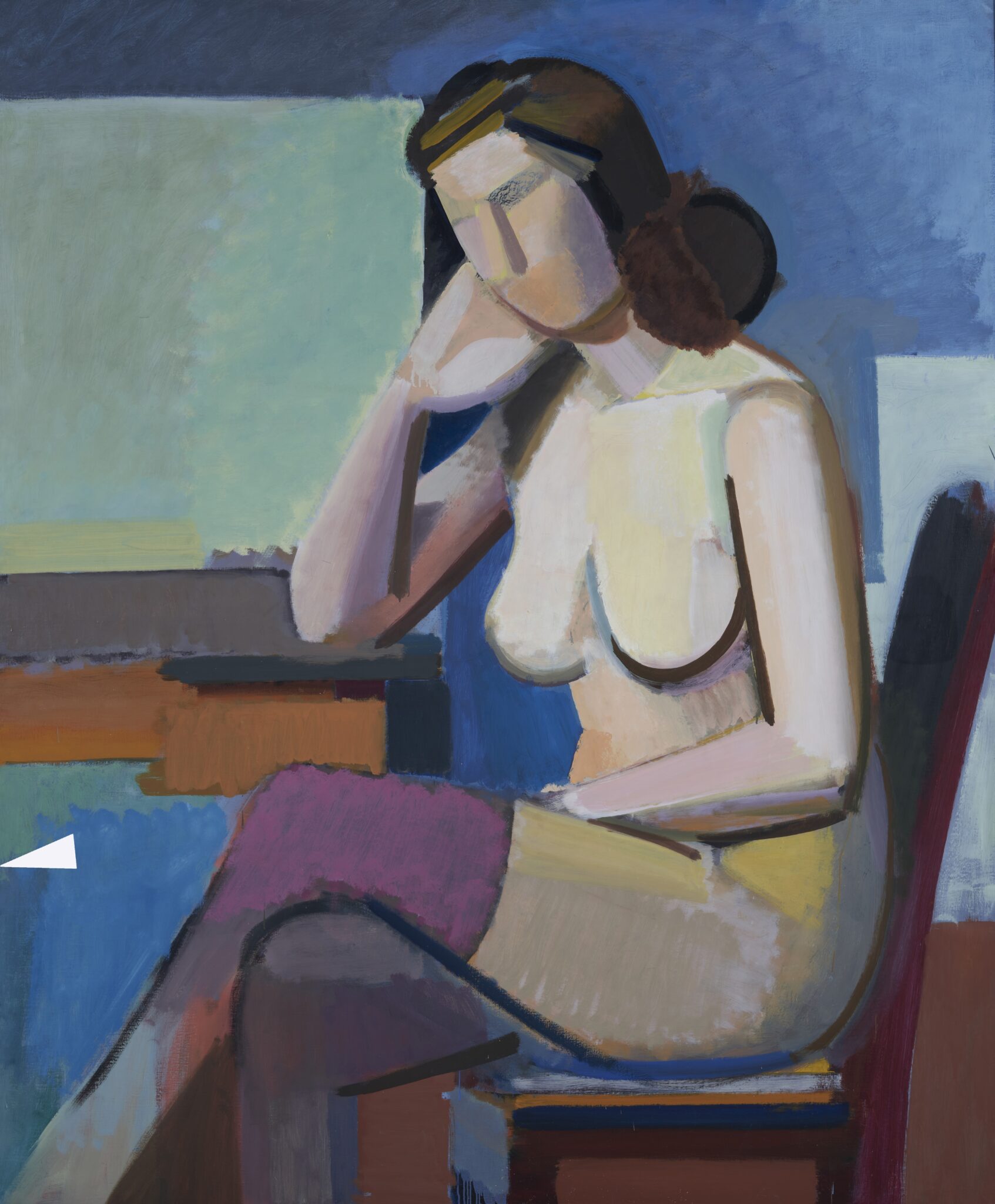
![Fig. 56. Farvesnit fra Model [fig.6a]. Tal i farvesnittet angiver analysepunkter, se tabel 2.](https://www.perspectivejournal.dk/wp-content/uploads/2026/07/Fig.6b.jpg)
The colour experiments beneath the surface do not seem to have had the same significance for the final result in the two early paintings whose stratigraphy we examined. In the two cross-sections from the painting Nature morte (1923–25), several different colours can be seen, but none of the colours beneath the surface are used in the final colour composition [Figs. 4a and 4b]. The painting’s final paint layer has been applied opaquely, and Lundstrøm does not appear to have intended the underlying layer to shine through. In the other painting from this period, Still Life with Fruit (c. 1925), the blue background is built up of nine to ten layers in different shades of blue [Figs. 5a and 5b]. SEM-EDX mapping of the cross-section39 showed that cobalt occurs only in the seventh layer, indicating that cobalt blue was used in this layer, marked as analysis point 6 in Fig. 5b. The cobalt-blue layer appears as the strongest and most saturated of the blue shades in the cross-section. Given that cobalt blue, as mentioned above, is the most expensive of the blue pigments, one might reasonably have assumed that Lundstrøm would have used this colour in the final layer. But the cross-section shows that Lundstrøm painted over it, first with a blue lightened with a considerable amount of white, and then with a blue in which red, orange and green pigments can be observed in the cross-section [Fig. 5b]. The addition of these colours to the blue reduces its intensity. The construction of the colour field suggests a degree of indecision during the process of making this painting.
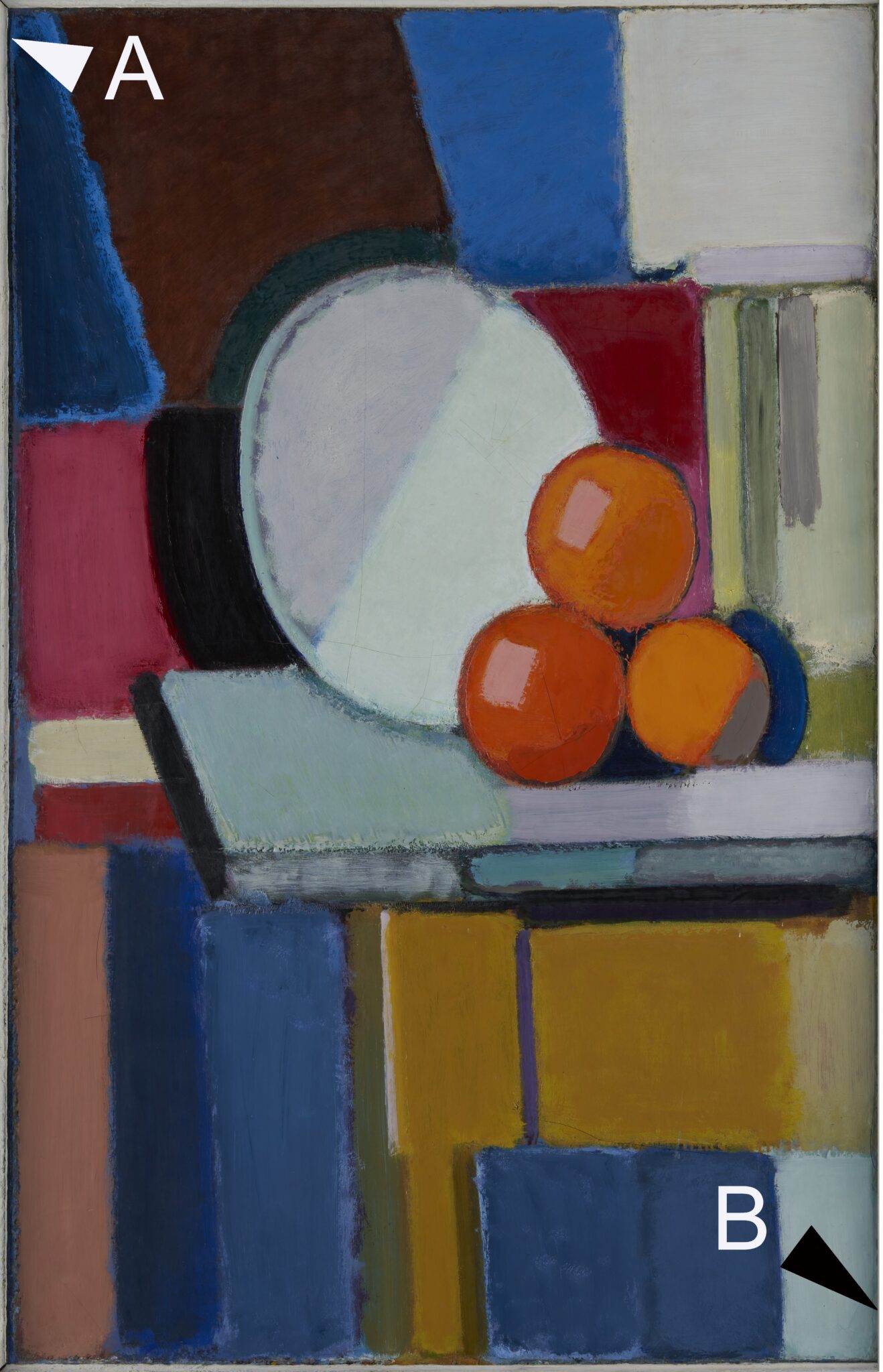
![Fig. 7b. Farvesnit fra Nature morte [fig.7a]. Tal i farvesnittene angiver analysepunkter, se tabel 2.](https://www.perspectivejournal.dk/wp-content/uploads/2026/07/Fig.7b.jpg)
The examinations showed that Lundstrøm went through a long process in order to arrive at the final colour composition in the paintings from the 1920s and in the late paintings from the 1940s alike. But whereas the underlying paint layers in the two early paintings do not seem to have great significance for the final result, the situation is rather different in the late works, where the underlying layers appear to play a constructive role in the final colour composition. Whether this limited material is sufficient to support the conclusion that Lundstrøm’s handling of colour underwent a more general shift during the working process is doubtful. It does, however, suggest a hypothesis that would be worth testing in future studies of his painting technique.
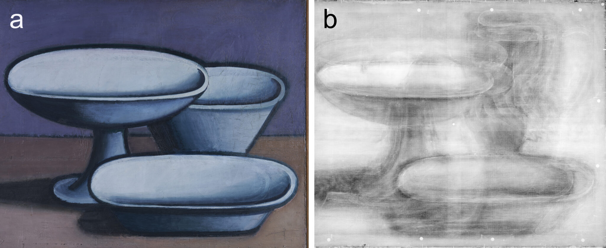
X-radiograph of Nature morte (1923–25)
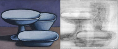
In Nature morte (1923–25), Lundstrøm depicts two empty dishes and an empty bowl in front of a violet background [Fig. 8a]. The objects are painted with clear contours and shadows. Paint cross-sections from the painting show that Lundstrøm built up the image using more than twenty paint layers [Fig. 4b]. The composition did not come easily to him. With the naked eye, it is possible to see that the rims of the dishes have been shifted and the perspective adjusted, and that the stemmed dish once also contained round objects, probably oranges. The X-radiographs make these changes more clearly visible [Fig. 8b]. At one stage, the still life included a jug in the background; its position was altered several times before it was ultimately painted out and replaced by the tall bowl seen in the finished composition. In the foreground, there was an upright object, probably a bottle, which was likewise painted out.
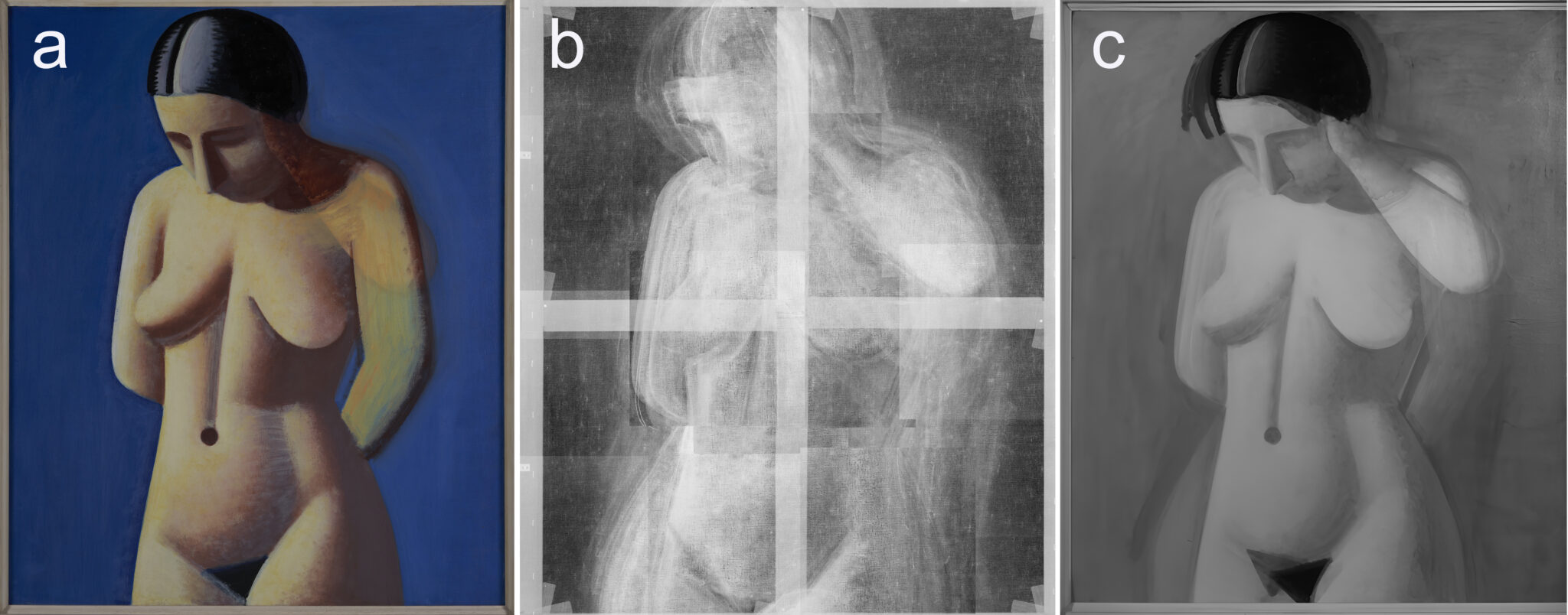
Model (1928–29) and the mysterious arm
Lundstrøm’s Model shows a standing nude woman in front of a blue background [Fig. 9a]. The woman looks down and has her arms behind her back. In an earlier version, her left arm was raised towards her hair, and Lundstrøm has done little to conceal this in the final version. Thus the final arm is painted quickly, with open brushstrokes that allow both the earlier arm and the blue background to show through. In the X-radiograph and IR images [Figs. 9b and 9c], the earlier arm appears more fully worked up and complete than the arm Lundstrøm ultimately painted [Fig. 9a].
But the arm is not the only thing Lundstrøm corrected. The X-radiograph shows that the entire body was moved back and forth several times before Lundstrøm reached a final decision. Each shift appears with a clear contour in the X-radiograph, showing that Lundstrøm completed one position before moving the model again and again [Fig. 9b]. The IR image supplements the X-radiograph, particularly as regards Lundstrøm’s alterations to the black colour in the woman’s hair and genitals. The black pigment contains carbon, which does not block X-rays and therefore does not appear in the X-radiograph. However, carbon does absorb infrared radiation, and the IR images make changes in the black colour visible. Specifically, the changes in the position of the hair in the IR image correspond to changes in the position of the face in the X-radiograph. The IR image shows how the position of the woman’s genitals has changed, while this aspect is not visible in the X-radiograph [Fig. 9c].
At Kunstmuseum Brandts, visitors have often wondered about the ghost arm in Model. Why did an artist of such perfectionism not do more to conceal the earlier version of the arm? It seems almost careless. Did he not finish the painting? Or did Lundstrøm actually want the viewer to gain insight into his long struggle to achieve perfection? Did he wish to give the viewer a glimpse of the extensive compositional deliberations that preceded the apparently simply painted female figure? Did he want to show that the process is every bit as important as the result? This would be one possible answer to why Lundstrøm did not entirely paint over the arm that is so much more fully finished than the one he ultimately painted with rapid brushstrokes.
Still Life with Jugs (1930–32)
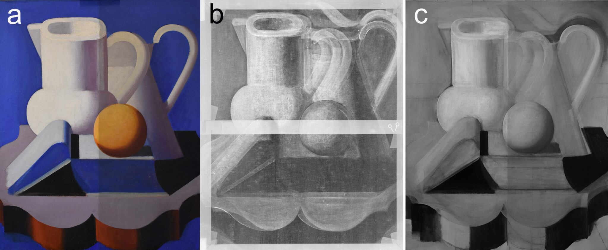
Still Life with Jugs from 1930–32, one of Lundstrøm’s major works, shows a table with an open book with an orange perched on top. In the background stand two white jugs. The jug in the foreground appears to be tilting: the perspective has been tipped so that we look down into it, whereas this is not the case with the jug in the background [Fig. 10a]. Fig. 10 shows the painting compared with the X-radiograph [Fig. 10b] and the IR image [Fig. 10c]. In the exhibition, the painting was shown half-cleaned, which explains why the right-hand half is darker in visible light and IR.
Here too, the X-radiograph and IR image show that Lundstrøm made countless corrections to the composition. The most striking alteration is seen in the jug in the background, which once had a spout that, at an earlier stage in the painting’s development, rose above the jug in the foreground. In the final image, the spout has been cut off, and the handle of the jug seems strangely suspended. The X-radiograph shows that the handle was previously placed higher up. It had been fully worked up, and the paint layer was thicker than in the handle of the final version. In addition, the X-radiograph shows that the jug in the foreground was systematically made wider towards the right in four or five stages, with the handle being shifted each time. Each version was fully worked up and appears clearly in the X-radiograph. The orange used to be smaller, and the form of the table was also altered several times [Fig. 10b].
Given the extensive corrections visible in Lundstrøm’s paintings, one would not expect him to have made thorough preparations before setting brush to canvas. The IR images, however, tell a different story.
Underdrawings, inscriptions, grids and construction lines in Lundstrøm’s paintings
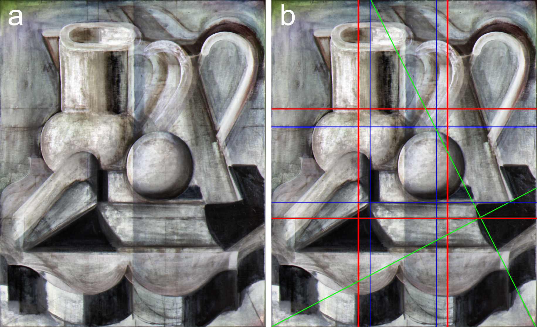
In order to examine the infrared images further, we generated IRFC (infrared false-colour images) of Still Life with Jugs (1930–32) and Model (1928–29), respectively, and enhanced the contrast of the colour images [Figs. 11–14]. The IRFC image of Still Life with Jugs clearly shows a number of underdrawings which differ from the final composition in several respects [Fig. 11a]. The underdrawings reveal that the table was originally smaller and differed in shape from the final result, that the jug on the left was narrower, and that the rear jug had a spout projecting above the one in front. Perhaps most surprisingly, given the many changes, the IRFC image also shows that Lundstrøm drew construction lines on the canvas as the basis for his composition. In Fig. 11b, the construction lines are marked in red, blue and green respectively to show how Lundstrøm made use of several classical rules of composition. The red lines follow the rule of thirds, while the blue lines reflect the golden section (1:1.618). Both compositional principles are often used to create harmonious and visually pleasing proportions [Fig. 11b].40 In addition, two diagonal lines are visible, marked in green. The principal compositional elements – such as the two jugs and the open book – are carefully positioned along these lines.
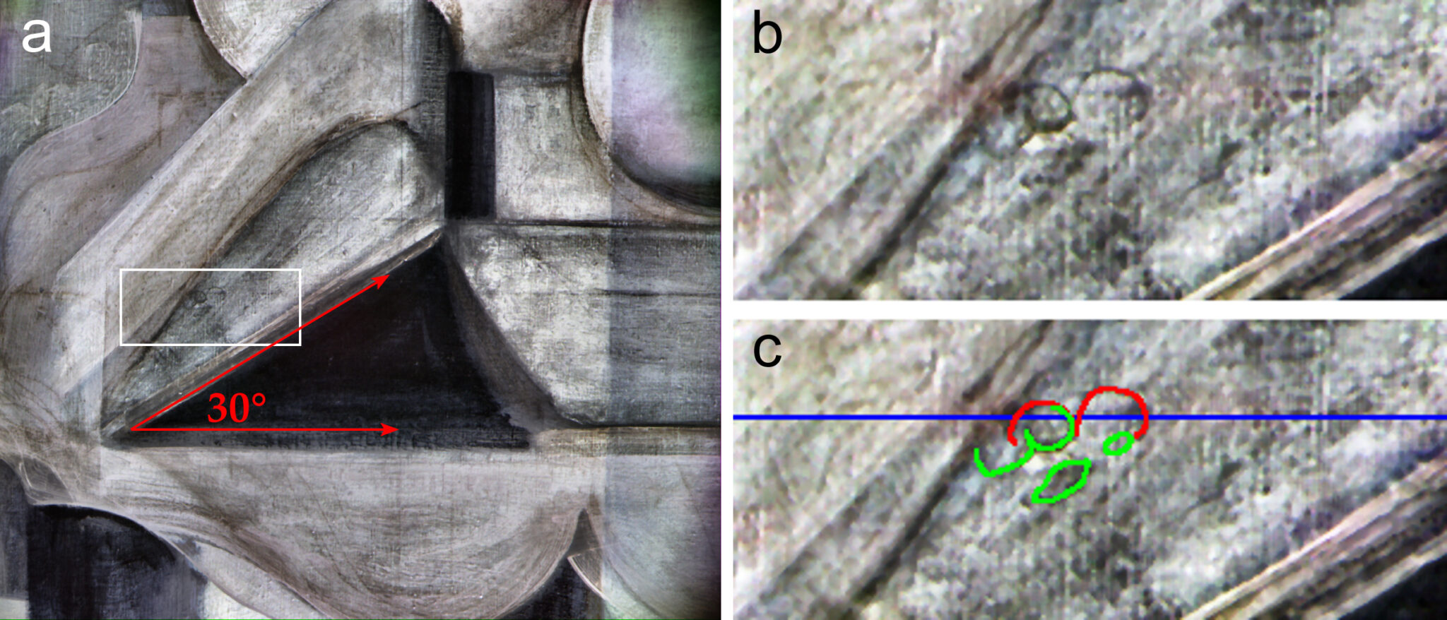
Closer analysis of the painting’s details also revealed hidden inscriptions. In one of the close-ups of the spine of the book [Fig. 12a], specifically in the area marked with a white rectangle – shown enlarged in Fig. 12b – the number three can be identified, coloured red in Fig. 12c. The number is positioned precisely on one of the blue lines from Fig. 11b. The images also show an angle of 30° (marked in green in Fig. 12c), corresponding to the angle between the spine of the book and the tabletop in Fig. 12a.
This discovery shows that Lundstrøm not only employed geometrical principles in his composition, but also made precise measurements before the painting process began. The underdrawings thus reveal a considered and methodical approach, in which he established target positions for the main elements in order to achieve a visually harmonious picture.
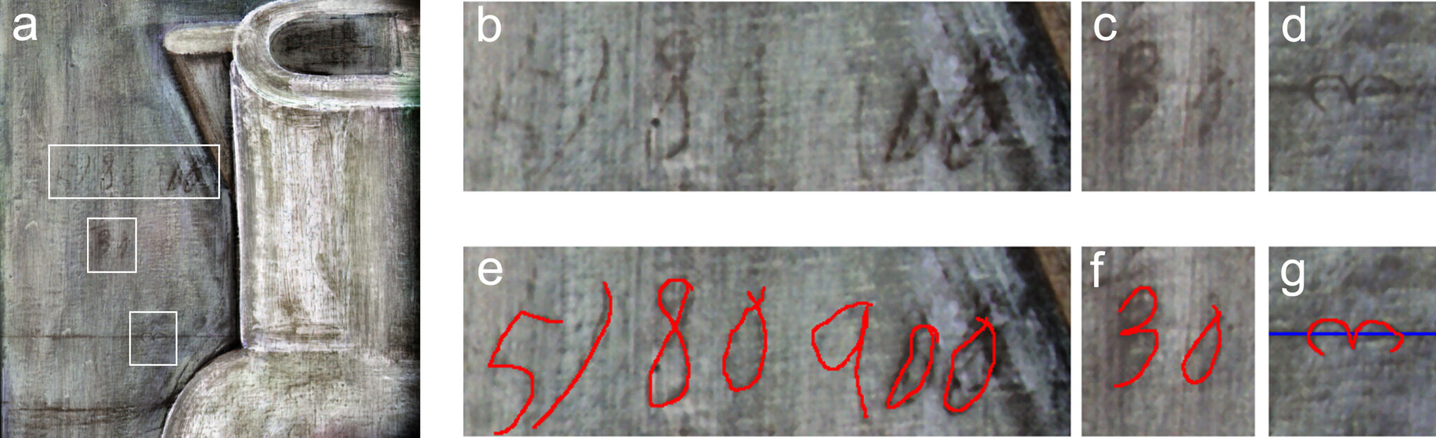
Further analyses of the painting revealed several inscriptions in the underdrawing, marked with white rectangles in Fig. 13a: the number three placed on the upper horizontal grid line [Figs. 13d and 13g] and the number ‘30’ [Figs. 13c and 13f]. The largest inscription is less clear [Fig. 13b], but appears as ‘5/80 900’ in Fig. 13e, where the inscription is coloured red. This marking may suggest a possible coded reference or measuring note from the initial sketching phase.
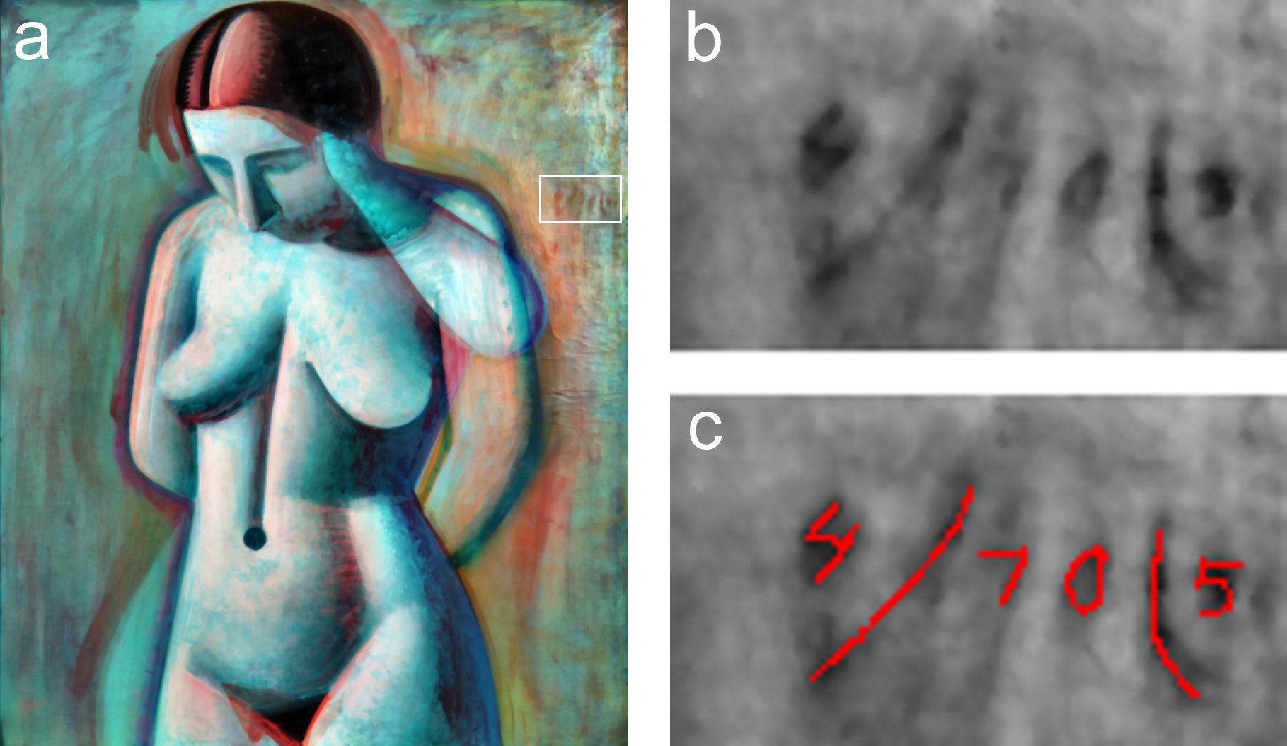
Fig. 14a shows the IRFC image of Model.41 Although the image did not reveal underdrawings like those in Still Life with Jugs, inscriptions were identified in this painting, too. These are positioned to the right of the woman’s left shoulder, marked with a white rectangle [Fig. 14a]. An enlargement of the area is shown in Fig. 14b, where the numbers ‘4/70/5’ appear. The inscription is coloured red in Fig. 14c. It should be noted, however, that the interpretation of such inscriptions is subject to some uncertainty, since they are often faint and covered by overlying paint layers.
These findings show that Lundstrøm worked systematically with both proportions and measurements at an early stage of the construction of his compositions.
The hidden cobalt blue
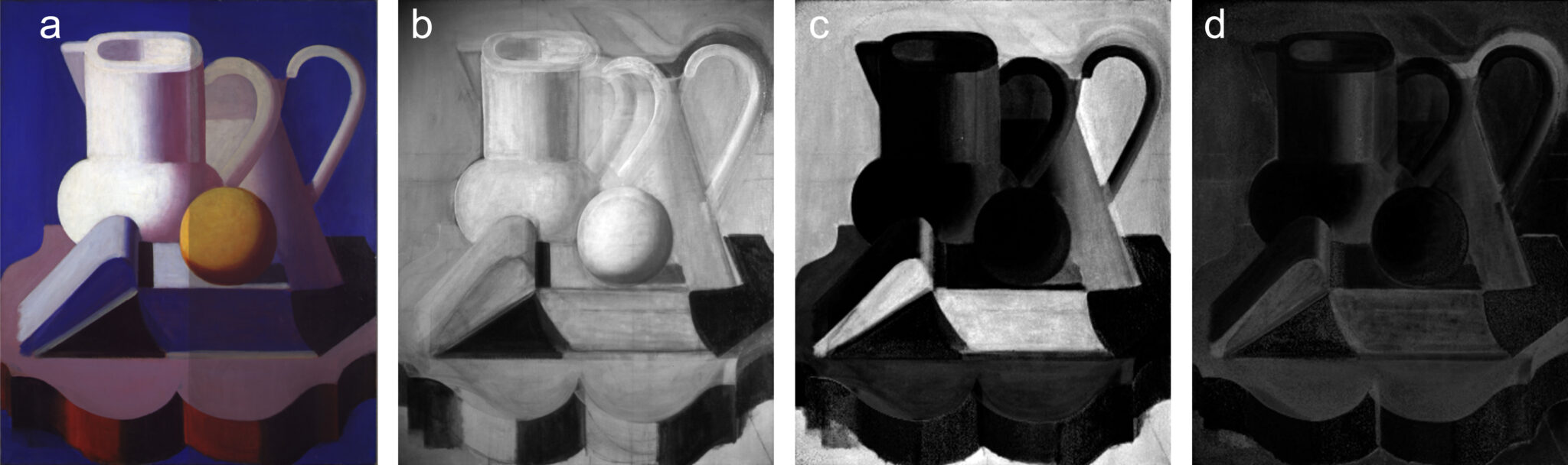
Prior to examining the painting Still Life with Jugs, we initially assumed that ultramarine would be the only blue pigment used. Spectral unmixing of the hyperspectral images, however, showed otherwise. As expected, the results suggested ultramarine in all the blue areas, but they also indicated cerulean blue or cobalt blue in a smaller area above the handle of the right-hand jug. XRF detected cobalt, but not tin, in this area, confirming the presence of cobalt blue. The results show that Lundstrøm must have amended the handle with cobalt blue, after which he painted up the background in ultramarine.
Figs. 15c–d show a comparison between the abundance maps for ultramarine and cobalt blue and an image of the painting in ordinary light [Fig. 15a] and IR [Fig. 15b]. White areas in the abundance maps indicate the presence of the pigment in question. In the abundance map for cobalt blue, the pigment could not be confirmed by XRF in the faintly whitish areas, but was clearly present in the strongly white area above the jug’s handle [Fig. 15d]. Cobalt blue is one of the few coloured pigments which, like black, carbon-based pigments, absorbs IR radiation, and in the IR image the area appears dark. This means that an infrared image alone could easily be misinterpreted, reading such an area as dark hatching or underdrawing, or as an underlying black paint layer.
The discovery of the hidden cobalt blue demonstrates the potential of hyperspectral analyses in terms of revealing changes in pigment composition that could easily be overlooked using other methods. But it is also an example of how a single analytical method can rarely stand alone.
Conclusion
In several paintings, Lundstrøm went through a long process before arriving at the finished result, and the surface visible to the naked eye may conceal a large number of experiments with both colour and composition. This article has examined Lundstrøm’s experiments with the colour blue in particular. Although Lundstrøm allegedly used the term ‘eternal blue’ for his blue backgrounds, he rarely painted the blue background in the same way twice. Lundstrøm often used more than one blue pigment in the same painting, and the exact ratio and composition of those blue pigments varies from one painting to the next. Our investigations thus confirm Kaaring’s study, which showed that Lundstrøm’s ‘eternal blue’ cannot be linked to any particular blue pigment; rather, Lundstrøm experimented with the colour blue throughout his life. This is perhaps most clearly expressed in our identification of the modern pigment PB15 in two of his late works from the 1940s. The pigment first arrived in the market in the mid-1930s, and the authors are not aware of any earlier examples of its use by a Danish artist. Several paintings show that Lundstrøm experimented extensively with the build-up of paint layers, rather than following a classical, logically structured approach. One example is his unconventional use of the pigment cobalt blue in Still Life with Fruit (c. 1925) and Still Life with Jugs (1930–32). Cobalt blue was by far the most expensive of the blue pigments at the time and might therefore be expected to appear only in the final layer. But in Still Life with Fruit, a cobalt-blue layer was painted over at least twice with other blue colours that contain no cobalt blue and do not have the same chromatic intensity; and in Still Life with Jugs, Lundstrøm used cobalt blue to amend the jug’s handle, after which the background was painted up in the inexpensive ultramarine. In his latest works, however, Lundstrøm seems to use underlying colours more deliberately in constructing his colour fields, allowing the penultimate layers to shine through the final layer so that the underlying colours assume greater significance for the final painterly expression.
Lundstrøm experimented not only with colour, but also with composition. X-radiographs of three paintings revealed that he repeatedly altered the subject matter of his paintings or how it was positioned on the picture plane. Often, he appears to have fully finished painting his chosen motif before he went on to move it around again and again.
Despite the many corrections, Lundstrøm began his process by carrying out thorough preparatory work. Hyperspectral analyses revealed grids and construction lines, underdrawings and small notes beneath the paint layer, all serving as the point of departure for his composition. Hidden marks and angles testify to an artistic process in which geometry and precision played a central role.
Perhaps it is time for a more nuanced view of Lundstrøm – one that looks not only at the perfection of the final composition, but also at the path by which he arrived there. This path is sometimes revealed on the surface, either in the form of conspicuous corrections, such as the ghost arm in Model (1928–29), or where the composition bears the marks of something having happened to the motif along the way – as in the case of the handle that seems to hover awkwardly in Still Life with Jugs after the top of the jug had been shortened. If, as an observer, you detect corrections on the surface of Lundstrøm’s paintings, you can be almost certain that those are merely the tip of the iceberg, and that beneath the surface lie many versions of the image we see before us.
Acknowledgements
The authors wish to thank Lars Brock Andersen, Signe Nygaard and Gerd Nebrich for the X-ray analyses; Marie Bitsch Christiansen for assistance with paint cross-sections and analyses; Troels Filtenborg for lending the paint cross-section from SMK’s painting Female Model; and Bjarke Jensen for his help in interpreting the XRF analyses. The TORCH project was supported by Interreg Deutschland–Danmark and EU grant no. 04-3.2-23 2.
Tables
| Title/ inventory no. | Date/ size | Blue pigments identified/ analytic method |
|---|---|---|
| Still Life (FKM/JWL 42) | 1918 (68 x 97 cm) | Background: Prussian blue (FTIR) |
| Reclining Model (FKM608) |
1921 (90 x 188 cm) | Blue stripes in rug: Ultramarine (FTIR) and cobalt blue (XRF) |
| Self-portrait (JWL 43) | 1921 (100 x 76 cm) | Turquoise blue background: Cobalt-containing pigment (XRF) Shadows: Ultramarine (FTIR) |
| Carnival. Niza (FKM 513) | 1922 (75 x 90 cm) | Shadows and eyes: Ultramarine (FTIR) |
| Nature morte (*) (**) (JWL 45) |
1923-25 (80 x 100 cm) |
Shadows: Ultramarine, Prussian blue (FTIR). Blue pigments in cross-section: See Table 2 |
| Still Life with Fruit (*) (JWL 44) | 1925 (60 x 73 cm) |
Shadows: Prussian blue (FTIR) Greenish background: Prussian blue (FTIR). Blue pigments in paint cross-section: See Table 2 |
| Model (**) (***) (FKM 2410) | 1928-29 (140 x 115 cm) |
Blue background: Ultramarine (FTIR), cobalt blue (XRF) |
| Mother and Child (FKM 548) | 1929 (195 x 130 cm) |
Blue background: Ultramarine, Prussian blue (FTIR) |
| Still Life with Jugs (**) (***) (FKM 488) | 1930-32 (100 x 82 cm) |
Blue background: Ultramarine (FTIR) |
| Model (*) (FKM 444) |
1941 (194 x 160 cm) |
Blue pigments in paint cross-section: See Table 2 |
| Nature morte (*) (JWL46) |
1945 (110 x 71 cm) |
Blue pigments in paint cross-section: See Table 2 |
Table 1. Overview of works and identified blue pigments. Asterisk indicates works where (*) paint cross-section, (**) X-ray, (***) hyperspectral analysis was carried out.
| Title/fig | Thickness of paint cross-section (approx.) | Number of layers (approx.) | Blue pigments. See figures for the location of the analysis points* | ||||||
| Nature morte fig. 4b |
|
|
|
||||||
| Still Life with Fruit Fig. 5b |
900 µm | 9** | 1, 4–5: Ultramarine; 2: Prussian blue; 6: Cobalt blue (SEM-EDX); 7: Ultramarine and Prussian blue | ||||||
| Model Fig. 6b |
170 µm | 8** | 1: Ultramarine; 2: Prussian blue; 3: PB15 | ||||||
| Nature morte Fig. 7b |
|
|
|
Table 2. Overview of paint cross-section analyses. *Identified using Raman unless otherwise stated. **The paint cross-section is not complete.
Notes
About the author