Summary
Landscape painting would not exist without an exorbitant use of a large variety of greens; either in glazes or as pastose and innovative dabbing’s of paint. Will our eye compensate for the flaws in the green hues when viewing a 400 years old aged painting and will current spectators create an intellectual compensation for its lack of intensity or presence? In twentieth century art some greens may stay hardly unaltered against other modern pigments of red, yellow and blue which may fade partly or completely. How do we then perceive deliberately colourful modernistic scenery when some of the originally vibrant opposing colours have completely disappeared?
Articles
Hans Christian Andersen (1805–1875) writes in his 1843 fairy-tale, The Ugly Duckling: “In this snug retreat sat a duck on her nest, watching for her young brood to hatch.” Further we learn that the other ducks “…liked much better to swim about in the river than to climb the slippery banks, and sit under a burdock leaf, to have a gossip with her”. The author then references a centuries’ old notion about a perfect and soothing green:
“Quack, quack!” said the duck, and quick as quick can be they all waddled out to have a look at the green world under the leaves. Their mother let them look as much as they pleased, because green is good for the eyes.1
Andersen offers no further explanation about the deeper meaning of his reference to the colour green and its allegedly attractive properties. However, having read a manuscript entitled The Emerald and The Eye, I understand Andersen’s intellectual baggage.2 The emerald’s green translucent colour was not just considered intriguing and beautiful, but also it was believed that it possessed a surprising power to be beneficial to sight. The author refers to Theophrastus (c. 371–287 BCE), who explained that the rare small stone called smaragdos is good for the eyes, which is why people carry emerald seals to improve their eyesight.3 We are thereby introduced to the emerald as a gemstone, but Theophrastus also describes a green pigment called Verdigris, a copper acetate originally made by hanging copper plates over hot vinegar in a sealed pot until a green crust formed on the copper. The crust could be scraped off and mixed with oil to be applied as a translucent green glaze with a lustre similar to that of an emerald. Artists used Verdigris as one of many ways of painting green leaves in the 17th century Netherlands.
From Emerald to Sottobosco
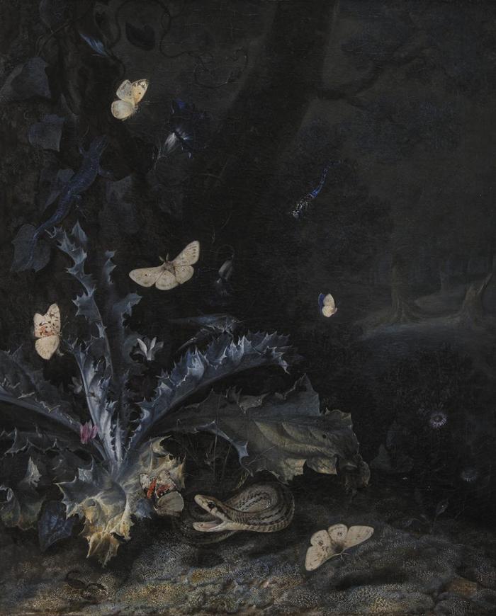
One of the painters who used Verdigris was the Dutchman Otto Marseus van Schrieck (1614–1678), who became famous for his invention of sottobosco (after the Italian word for undergrowth). He was not exactly doing urban plant research, but he was doing something very new, which was to take the close-up, observant approach of the still life painter and direct it outside – and downwards – to create nature studies that were carefully arranged but were set on the dark, damp stage of the forest floor. Van Schrieck’s still-life paintings are characterised by the presence of various living organisms (mainly insects and plants) of which some were attached directly in the wet paint on the canvas.4 [fig. 1] Van Schrieck did not only work in the Netherlands but travelled widely, especially in Italy. Besides an encounter with Samuel Dirksz van Hoogstraten (1627–1678), his relations with artists in Italy are only documented by van Schrieck’s “bent name” (given him by fellow Bentvueghels, a hard-drinking society of Dutch and Flemish painters based in Rome), “de Snuffelaer” (the sniffer or snuffler), as reported by both van Hoogstraten and van Schrieck’s biographer Arnold Houbraken.5 Apparently, he was so passionate about closely observing the critters and plants that he cultivated in a pond behind his house built especially for this purpose that friends nicknamed him “de Snuffelaer”. To Houbraken, van Schrieck was the man whom snakes obeyed; supposedly they would hold still for him until he finished painting.
His artist colleague van Hoogstraten saw in his art “what he tended to exhibit” – meaning the same eccentricity as his motifs.6 Although van Schrieck’s paintings are as much works of his imagination as of scientific observation, they could be described as the ‘science of representing the visible world’ in the sense described by van Hoogstraten.7 The paintings become more vivid the instant one recognises that they were not simply aesthetic renderings, but in fact early documentation of discoveries in natural history; discoveries that forced tradition to grapple with knowledge of the world that was attained later and remains valid even to this day. Scientific instruments, scholarly writings and drawings and prints that were used to communicate these discoveries can now help to restore a context for these paintings – a context without which they might seem just curious and strange.8
Different 17th century greeneries
What really interest us in this context are van Schriek and his contemporaries’ use of green; that is, how they gave the impression of green in their paintings when they painted vegetation or objects that appear green in nature. Was this straightforward or could the making of a convincing green image be associated with difficulties or even hold a variety of interpretations?
The following examples of artists’ use of mixtures of blue and yellow pigments or dyestuffs to create green are from the very well-researched Oranjezaal, part of the royal palace Huis ten Bosch in The Hague.9 The interior was decorated between 1648–1652 with 39 canvases and panels by twelve artists active at the time in both the northern and southern Netherlands, each of them having their own reputation – and idiosyncratic way of mixing paint for their artworks. One of these paintings, Frederik Hendrik as a warrior and superior over the sea (1649–1651), is attributed to Jacob van Campen (1595–1657) and depicts a light blue landscape in the background and a grey and muted green underpainting, which is mixed from lead white, umber and smalt.10 11 The umber is a natural mixture of iron and manganese oxides and hydroxides that has earth tones from cream to brown depending on the amount of iron and manganese compounds it contains.
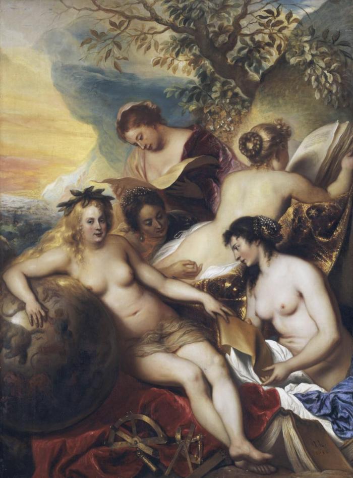
However, to achieve the green of the leaves of the tree in the background of the Five muses on the Parnassus (1650), van Campen’s Leiden colleague Jan Lievens (1607–1674) mixed lead white, lead-tin yellow, indigo and carbon black with a small addition of chalk and red earth pigment.12 The hill on the right in the background was worked out with yellow earth pigment, indigo and lead white. The bright leaves in the trees are bluish green in colour. The pigment mixture for this colour contains, among other things, the blue indigo and a small amount of chalk, which may indicate the use of a yellow lacquer. The leaves may have faded due to discolouration of these light-sensitive pigments.13 [fig. 2]
However, in his The good management by Frederik Hendrik (1649–1651),14 Pieter Soutman (1593/1601–1657) used azurite for the blue flowers as well as for the leaves in the greenery.15 In the latter, he combined this pigment with yellow lacquer, yellow ochre and lead-thin yellow in varying combinations. The mineral blue was thus mixed with three different yellow colorants or pigments to produce grades of green; yellow lacquer would be a translucent medium stained by yellow dyes. The so-called ‘Dutch pink’ was a yellow lake based on buckthorn berries.16 The second yellow employed by Soutman was yellow ochre, a natural mineral consisting of silica and clay owing its colour to an iron oxyhydroxide mineral, goethite; finally, Soutman mixed azurite with the stable and warm canary yellow called lead-tin yellow, originally developed in the Flemish ceramic industry.17 The green produced by this variety of mixtures would satisfy the artist’s need for painting convincing foliage.
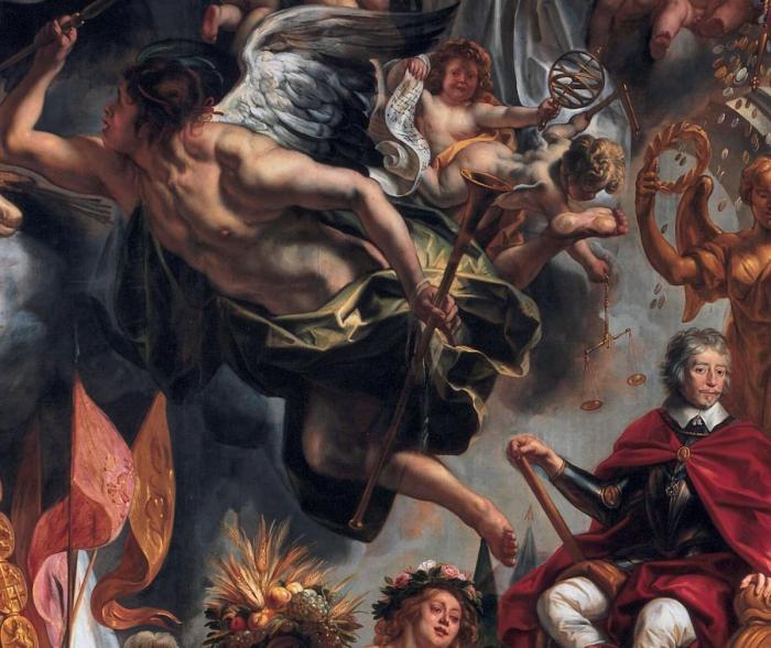
From the above three painters who worked on the decoration of the Oranjezaal, we observe the use of three different blue pigments mixed with yellows to produce green. However, this is not all; another two blues called verditer and vivianite may also be employed in a mixture to achieve green hues for vegetation. In The triumph of Frederik Hendrik (1652),18 Jacob Jordaens (1593 – 1678) [fig. 3, detail Hymen] painted the green drapery of Hymen wearing a green coat of blue verditer with yellow lacquer, on which he made accents composed of a mixture of azurite, yellow ochre, lead tincture, lead white, black, orange and red pigments.19 Finally, mention should be made of Theodoor van Thulden (1606 – 1669), who used pigments that quickly decolourise in the now pale greens of the garlands in his Venus in the store of Vulcanus (1650):20 vivianite (probably) with yellow lacquer (chalk identified), some lead-tin yellow and lead white, some red ochre, some smalt and charcoal black.21 So five out of twelve painters within the same decorative scheme of the Oranjezaal painted greeneries in a broad range of blue pigments mixed with yellows: the making of green was complex and could inspire artists to explore many combinations of pigments to achieve the hues of green they desired for the broad spectrum of green tonalities in nature.
Pigment theories
Theoretical writers of the time also took time to give advice on painting green – and their instructions on preventing discolouration are varied. One of the most cited books is Karel van Mander’s (1548–1606) Het Schilder-boek, which he published in Haarlem in 1604.22 The introduction of the book, Den grondt der edel vrij schilderconst [The essentials of the art of painting], is written as a didactic poetry in which van Mander discusses, among other things, painting human proportions and landscapes. For the latter, he writes, the painter must consider the right choice of blue and yellow pigments needed on his palette to create a beautiful green.23 He also writes about the durability of pigments and their characteristics. He warns the inexperienced painter against using lampblack, red lead, Spanish green and orpiment. The latter is poisonous, as it contains arsenic sulphide, and Spanish green (also called verdigris) may change and darken over time. Due to the instability of some and hazards of poison from other pigments, the painter must keep his brushes clean and neat.24
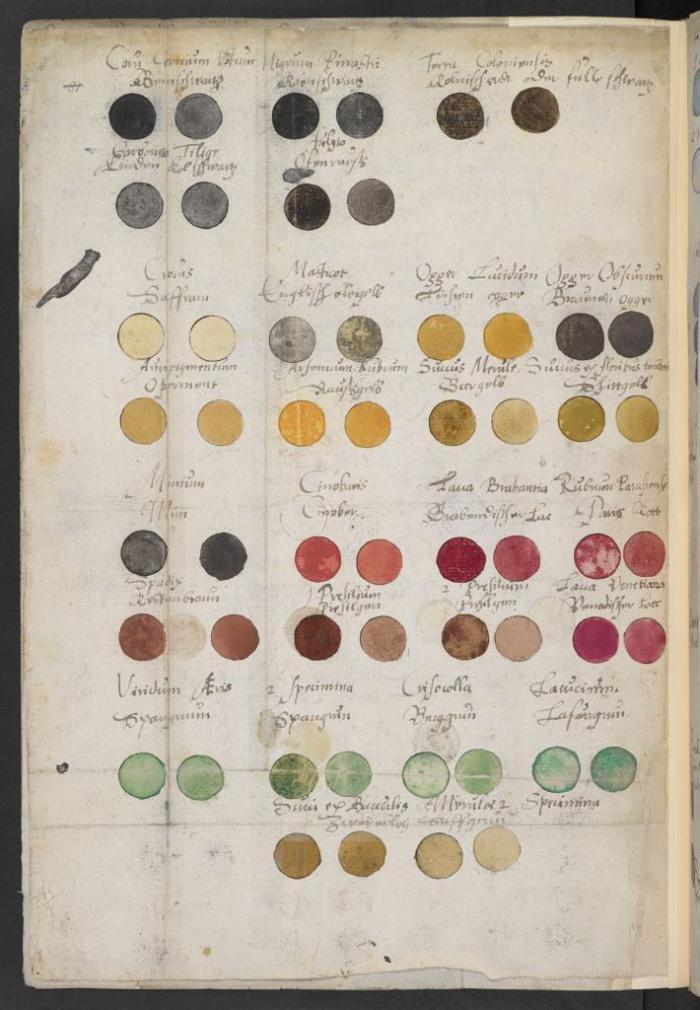
Approximately two to three decades later, the Swiss physician Sir Theodore Turquet de Mayerne (1573–1654/55) also warned painters against using Spanish green or verdigris. As an important 17th century source on painting techniques, the de Mayerne manuscript is a huge compilation of miscellaneous notes and artists’ interviews collected between 1620 and 1646.25 The manuscript is a particularly important resource for our understanding of painting as it was practiced at the English court. De Mayerne describes the preparation of a variety of pigments, oils and varnishes, and provides the recipes and description of his experiments, including commentaries in the margin. [fig. 4] In the manuscript, we find several recipes for the preparation of greens, often by admixing blue and yellow. De Mayerne writes that all sorts of green can be made by diverse mixes of “schiet” yellow, yellow ochre, azurite ash, white lead and black earth, and he refers to a recipe on how to produce Labeur de Vert. De Mayerne writes:
‘Beautiful green. Ash and Masticot, [makes a] strong bright [green]. Ash and Pink to shadow the mentioned green. If one wants to make the green more yellow one adds more Masticot. Greener one adds more Pink with cendree. More blue one adds more Ash. More white to all these layers one adjusts [with] lead white and a Schiet yellow glaze, one adjust this as one desires with a little Ash.26
At the end of the 17th century, van Hoogstraten informs the reader that artists have seven primary colours available.27 His description of these seven colours is related to the traditional views that colours are associated with specific humours and moods, and therefore they also relate to the characteristics of the planets.28 Green is attributed to Venus due to its significance of youth, beauty, joy and unadulterated life. Van Hoogstraten also quotes Seneca,29 stating that green refreshes the unhealthy eyes,30 which reflects the conception Hans Christian Andersen alluded to in The Ugly Duckling cited above. However, van Hoogstraten also laments that contrary to the abundance of red and yellow pigments available, the artist only has a limited range of greens to choose from. He concludes that terra verde is too weak, Spanish greens are too cruel, and that the ashes are too short-lived.31 Further he writes that “mountain green” was used in the past to paint larger areas of little importance.32 Describing the rainbow with all its colours, he poetically writes:
The blue fits purple, and purple also red
Red fits orange, if yellow doesn’t blend in
Yellow loves green, and green likes to be connected to blue.33
Perception
Van Hoogstraten’s flourishing phrases do not assist us much in understanding the struggles, deliberations or choices that 17th century artists were confronted with when setting out to paint a convincing green plant, let alone several plants or types of vegetation that required a large variety of green hues. During the exhibition Flowers and World Views at the National Gallery of Denmark (SMK) in 2013,34 a number of exquisite flower pieces, such as those by Ambrosius Bosschaert (1573–1621), Balthasar van der Ast (1593/94–1657) and Jan Davidsz de Heem (1606–1683/84), impressed the viewers with an abundance of blossoming flowers that often represented several seasons simultaneously, adorned or framed with green leaves in a wide variety of shapes and stems. One of these paintings, by the aforementioned van Schrieck, depicts the sottobosco with a thistle in the foreground and a snake meandering out from behind it, snapping at one of several butterflies – a prey that a snake would never opt for in reality [fig. 1].35 Although the real butterflies deliberately stuck in the wet paint have lost their original colourfulness over time and the contrast in the claire-obscure may have been exaggerated due to a natural darkening of the materials, the viewer would not necessarily be observant of this. What is more, the limited palette of mossy greens, ochre yellows, and bluish greens in a sottobosco scene might be fully accepted by the eye, although a certain creepy atmosphere or aura over these undergrowth scenes now prevails due to the fading of the originally green leaves into blue.
Human colour perception, however, is determined by the nature of incident light that illuminates the object, the physio-chemical composition of the background and the observer’s entire visual system. Nevertheless, it is my observation that the majority of visitors did not contemplate the heavily changed colour of the thistle in van Schrieck’s sottobosco. Its leaves are blue today because the yellow component of the original mixture of blue-yellow from van Schriek’s palette has completely faded away. But only the informed eye notices this in the exhibition – and several other flower pieces show comparable tendencies of deterioration of the greens without arousing suspicion. The human brain appears to readily compensate for the discolouration, which we can call a spreading effect as in other similar visual illusions; we perceive the composition, the drama of the battle between good (butterfly) and evil (snake) within the greenish forest scrub with a sensation just as intended by the 17th century artist.
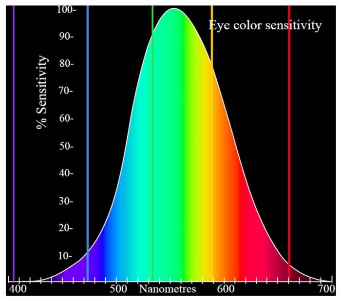
The psycho-physiological understanding of light and colour begins with Newton, who demonstrated that the rays are not coloured, by dividing the light in the spectrum by a prism and converging it again with another reversed prism and a convex lens.36 In this important experiment, he showed that when the spectral colours are placed in a circle, the colours opposite each other are complementary and form white light when combined. As early as the 19th century, the founders of our modern explanations of colour vision, Thomas Young (1773–1829), James Clark Maxwell (1831–1879), and Hermann von Helmholtz (1821–1894) described the trichromatic theory of colour vision, which states that three colour receptors, blue (S), green (M) and red (L) are needed for the production of most colours.37 Von Helmholtz later described the difference between Newtons’ additive physiological blend of the colours in light and the subtractive pigment mixtures.38 Ewald Hering (1834–1918) presented a rivalling colour theory based on two opponent pairs of colours, blue/yellow and red/green, plus the two neutral colours, black/white.39 Today this 19th century battle is resolved by the “two-stage theory” of G.E. Müller and others, which combines the theories by the two rivals von Helmholtz and Hering. We now know that the human eye possesses three types of colour-sensitive receptors, which combine their signals in three colour-opponent channels; the colour perception is linked to the cones which, through nerve cells in the retina, cooperate with each other to send a modulated signal to the visual cortex, where the colour is perceived, while the perception of objects at night is closely associated with the rods. At low light levels, typical for a museum environment with dimmed light values in order to protect the artworks from fading, the cones may register better the brighter, green, colours whereas the non-colour sensitive rods are responsible for our vision. [Fig. 5]
The perception of greenness (in opposition to redness forming one of the opponent mechanisms in human colour vision) is evoked by light that triggers the medium-wavelength M cone cells in the eye more than the long-wavelength L cones.40 Light that triggers this greenness responds more than the yellowness or blueness of the other colour opponent mechanisms called green. Are our eyes more sensitive to the stimuli and sensations offered by green – something that could be further underscored by our cultural upbringing? I shall leave this interpretation to those with sufficient scientific knowledge about colour vision; however, the discoloured bluish thistle in van Schrieck’s painting was mainly perceived as green by the public – the form of the object, the jagged leaves of the plant, indirectly guiding our brain to accept this notion – despite its current strong bluish tonality. Awareness of the blue, however, becomes evident to all upon explanation.
Modernism and new pigments and paints
We now jump in time to examine the pigment choices and possibilities for a modern 20th century painter of mythology and landscapes. Contrary to van Schriek, the modernist artist was not concerned with the likeliness of form and the colour of the individual object according to nature itself, but is concerned with the tonal values of compositions of green, red, yellow, and blue colour fields, and their interrelationship with the visual sensation of the beholder.
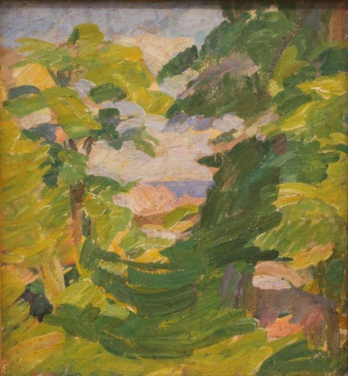
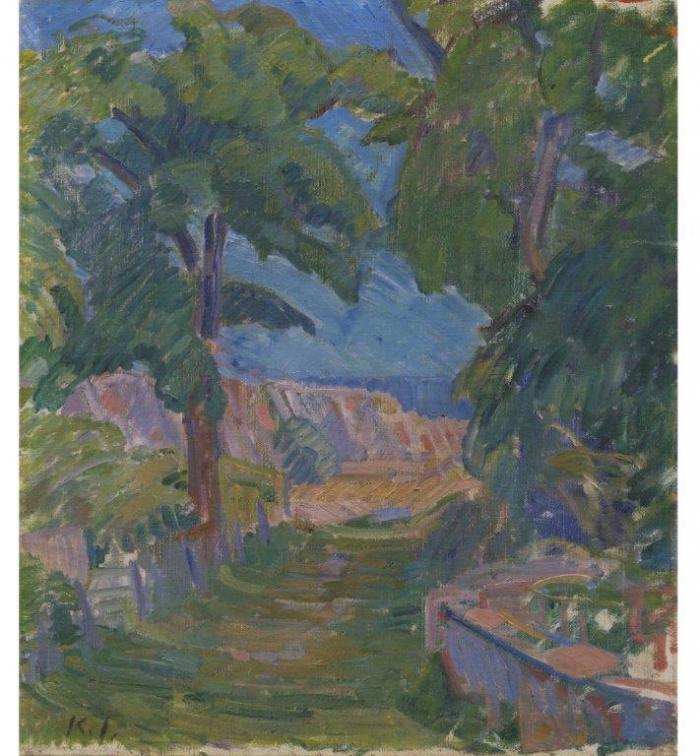
The Swedish painter Karl Isakson (1878–1922) was advised to immerse himself in clear air to treat his bad nerves, and thus he travelled to Danish island of Christiansø in July 1911. This prompted many innovative paintings of this location and its landscapes – and fostered new ideas of painting.41 Isakson became one of the most important exponents of modernism in Denmark and was particularly important to Edvard Weie (1879–1943), a key figure of the period of the so-called Bornholm School and part of a group of artists from the Kristian Zahrtmann (1843–1917) School.42 They were the first artists to sail to Ertholmene, a small group of islands including Christiansø north of Bornholm. Based on the landscape they began to express new artistic ideas and nature became a laboratory for new colour and form theories.
Both Isakson and Weie worked consciously with the dynamic and space-forming effect of complementary colours, and they each painted a landscape near “Mindet” on Christiansø. [figs. 6a and b] Isakson painted his view in 1911, a painting currently part of the SMK collection. Weie must have seen Isaakson’s painting, for his view of the same location from 1912 has the same vantage point as Isakson’s from the previous year. Both paintings are naturalistic at the outset, but Weie’s painting is freer and coarser in the brush strokes. Weie believed that the basic idea of all art-perception rests on the natural sensation, and he returned to the motif several times. However, the final addition of a mythological element gave the iconic landscape, with its bold application of red, yellow and blue paint, an impressive vibrant tension – in both a physiological and visual sense. It is important to note that while Weie developed his idea and worked on the landscape, the painters on Christiansø eagerly and intensively discussed issues relating to the art scene in Paris and the pivotal colleagues Cézanne, Gaugin and van Gogh.43 Colour-theoretical questions, particularly the appreciation of pure and serene tonalities of the spectral colours, were the topics of the day. These dialogues also included the theories of the neo-impressionist Paul Signac (1863–1935), who had aired a special attention towards the elemental colours blue, yellow and red, as well as to their increasing visual strength when set against their complementary colours, orange, violet and green.44
After Weie’s first encounter in 1912 with the view at Mindet, Isakson allegedly commented that “…in this composition one should add a faun and a nymph”.45 This suggestion was of great significance to Weie. It struck a chord in Weie, who was occupied with mythology and its significance for the understanding of humankind and the strong feelings and emotions that he sought to visualise in his paintings.
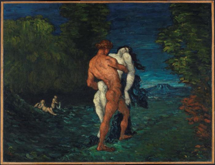
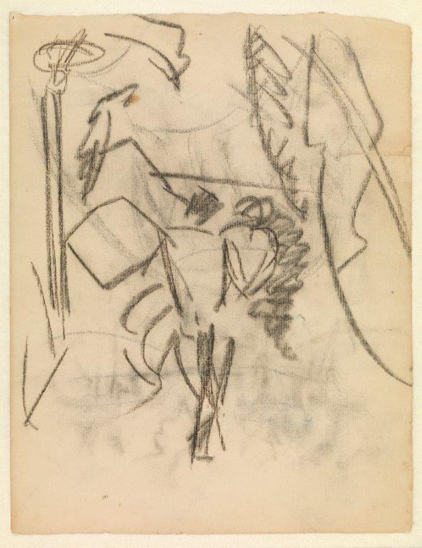
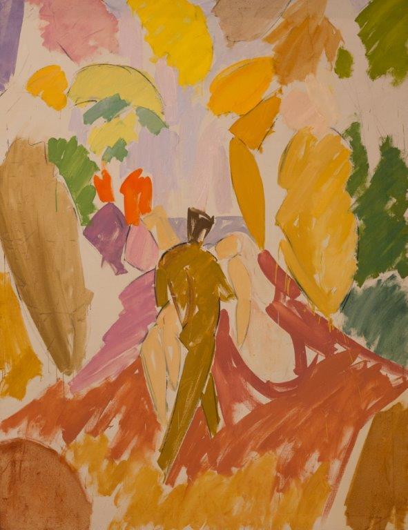
We do not know if Isakson showed Weie a reproduction of Cézanne’s L’enlevement (1866–1868)46 [fig. 7], or whether it was a later encounter with images of Cézanne’s works that prompted Weie to start a series of drawings of a faun with a nymph in its arms. The faun is moving through the green and brown forest, and down the tunnelling landscape of Mindet towards the coast under the blue sky. In the collections of SMK, a number of small and large drawings reveal that Weie was constantly searching for the right position and movement in the highly dramatic scene of the erotic abduction of the nymph. [fig. 8] The struggle with the composition resulted in the wonderful and breath-taking painting Faun and Nymph from 1940–1941. [fig. 9]
Observing the vanished?
The question is whether the painting that Weie finished after the many intermediary attempts still offers the same visual sensation as when it was viewed in 1941 upon its completion. In order to investigate this, we need to know more about Weie’s technique and palette – just as we examined the 17th century palette in order to understand the artists’ use of different pigments and dyestuffs to compose their visual sensations.
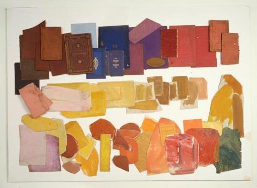
If one wants to know more about Weie’s tools and the colours he used, the Weie exhibition catalogue from 1987 refers to several testimonies.47 Some thought that Weie’s oil palette was somewhat limited, including only seven colours: light ochre, cadmium lemon, raw umber, cinnabar, dark madder lake, chrome green and ultramarine blue.48 If we compare this with Weie’s surviving colour tubes, we find a broader register that also comprises sienna natural and burnt sienna, cadmium orange, cadmium red and cobalt blue. Moreover, in a letter from Christiansø in 1919 to the art dealer Christian Larsen, Weie orders some paint; some of the colours ordered are found among the paint tubes mentioned above, but with the addition of both dark and bright cadmium orange.49 We also have interesting information about Weie’s work with tonal values from a collection of more than 80 paint samples collected by Jørn Rubow (director of SMK 1952–1978) in Weie’s studio, as it stood untouched right until his wife Agnes Weie’s death in 1964.50 [fig. 10] Weie’s friend, the painter Gustaf Wolmar, describes a visit to Weie’s poorly furnished room in Christianshavn in the beginning of the century, where Wolmar recollects seeing “färgrika klutar” [“colourful cloths or patches”].51 And lastly, in an interview about Weie’s studio, Leo Swane (director of SMK 1931–1952) says, “It was filled with piles of canvas samples; tone samples, experiments with colour values and compositions.”52
Based on the recent material analysis of Weie’s painting Faun and Nymph, we are able to list Weie’s palette more precisely and better understand how he mixed a variety of pigments to create his different colour values, harmonies and vibrant visual sensations.53 Some of the colours were mixtures of chrome green with cadmium orange and raw umber, while another sample showed natural sienna mixed with green.
In addition, there are patches of canvas and paper with saturated pure yellow (cadmium lemon), orange (cadmium orange) and red colours (cinnabar and alizarin), and a number of mid-tones up to light purple/pink. Chrome green is found in two samples, but no blue. Weie’s palette also included some of the new synthetic organic pigments of the period, such as naphthol red (red lacquer), a so-called azo-pigment.54 The classic azo-pigments have provided bright colours at low cost, but they are characterised by relatively poor lightfastness, degrading by UV light, and poor stability in heat (direct sunlight). This information is of significance to our understanding of Weie’s Faun and Nymph.55
By close examination of the painting itself, one notes that some of the colour areas have small holes in the paint matching holes in some of the tonal samples found in Weie’s studio and described above. Comparing the samples with the comparable areas of the painting, it becomes evident that the painting has suffered from high and long exposure to UV-light. We know that in the past the painting was hung in the tall, well-lit reception area of the SMK, across from the large glass doors of the entrance.56 From black & white photographs taken during the Weie exhibition in 1946 and again from the permanent display of his paintings in one of the galleries, one notices striking differences in the lack of tonality, particularly in the hair of the nymph. [fig. 11] Weie’s inspiration for the faun and nymph from Cezanne’s painting depicting a nymph with thick dark curls blowing in the wind. This is comparable to Weie’s black hatching in the drawings and sketches for the figure [fig. 8]; however, the photographs and his final – probably unfinished – Faun and Nymph show that the darkness of her hair has vanished over time. In contrast, some of the modern and pure greens of the forest have darkened a little and the purple patches of the sky above the faun have turned slightly violet. Most striking, however, is the apparent dramatic and irreversible fading of the mane of the nymph. What was its original colour within the composition: as dark as in Cézanne’s work and in Weie’s hatching on paper, or would it have had some significant colour matching the artist’s battle with modernist colour schemes and contrasts? Was Weie struggling with fugitive paint mixtures as did his 17th century colleagues? Indeed, recent scientific analysis has revealed that originally the hair of the nymph was a significantly positioned mane of dark red.57
Recalling how important the colour values were for Weie and his colleagues – discussing and testing how new artistic ideas and modern bright colours could be implemented and juxtaposed so that the opposing values of red and green would interact visually within the eye/brain of the beholder – today this drama is lost to the viewer. While the human brain can perceive the blueish thistle in van Schrieck’s paintings as green vegetation, the spectator is not able to compensate for the loss of the red hair in Faun and Nymph. In the latter painting we therefore observe the green as dominant and unchallenged by its original dynamic complementary counterpart.
The irony of the changes of van Schrieck’s mixtures of blue and yellow and the loss of the red in Weie’s composition where the green is still apparent is that the intensity of illumination (which altered both paintings) affects our colour perception. At very low light levels, blue and green objects appear brighter than red ones compared with their relative brightness in stronger illumination.58 And at higher levels of illumination, there is a related shift in hues: when the intensity of illumination increases, most colours appear less red or green and more blue or yellow.59 These effects of light intensity on the tonal variations, which again have a significant influence on the psychological impact of the colour to the viewer, are no longer of relevance in Weie’s work. However, the low light levels normally utilised in exhibitions of old master paintings will continue to offer us the intended visual impact of van Schrieck’s sottobosco depicting the battle between good and evil.
When searching for something to soothe their eyes, Hans Christian Andersen’s duck and her little ducklings would not be pleased to look at van Schriek’s blue leaves in his sottobosco but would probably prefer Weie’s more intense green forest views from Mindet on Christiansø. We may conclude that time has become a permanent part of the identity and perception of both these works. ▢
This article is an extended and reworked version of a paper given at the ’12th European Society for Literature, Science and the Arts’ (SLSAeu) Conference in Copenhagen 13-16 June 2018, which had a focus on the topic of GREEN. The author would like to thank Marjolijn Bol (Utrecht University) for inspiration (note 2), as well as Niels Borring (SMK), Anna Vila (Barcelona University), and David Buti (SMK-CATS) for information of their analysis of samples and paint by Edvard Weie. Further, I am grateful to Per Nellemann Bang, ophthalmologist, for suggestions and comments on issues relating to the human perception. See P. Nellemann Bang, Fra foton til Matisse via øjet (2014).
Copy-editing by Sofie Vestergaard Jørgensen.
The top image is a detail of Edvard Weie, Faun and Nymfph 1940-1941. SMK. See fig. 9.
Notes
About the author