Summary
What is digital art history? This recently established field extends across a wide variety of methodological, artistic, theoretical and historical studies in which the use of computers is part of the process. At the same time, thousands of cultural artefacts are currently being registered digitally, complete with metadata and photographs, providing a new basis for visual analyses by both humans and machines. The purpose of the article is to provide an introduction to aspects of the field of digital art history with a case study as its point of departure: a visual analysis, enacted by means of artificial intelligence, of digital photographs from the SMK – National Gallery of Denmark collection. To this end, the article explains a number of topics and concepts important for the work undertaken regarding visual issues in the digital field. One of the arguments put forward is that digital methods and concrete experiments with art historical material can prompt and motivate a critical reassessment of art historical work processes.
Articles
Various issues related to digital images have long been addressed by computer specialists and artists as well as by the digital humanities, where many different disciplines work with digital visual material. Discussions concerning the meeting of the realm of art history and computers were raised as far back as the 1980s, prompting the creation of the group CHArt (Computers and the History of Art). Since then, numerous art historians as well as academics from many other disciplines have specialised in the growing field of computer-based art and cultural phenomena. However, only recently has art history as a discipline made a more comprehensive, targeted effort to establish the field of digital art history, which addresses art history in all its scope and breadth.1 This means, among other things, that studies in digital contemporary art and media theory have been complemented – in terms of method, theory and didactics – by the computer-aided development of studies of older art and culture. So even though art historians have worked with digital art and media theory in the past, only now has the technology evolved to a point where it can have a more profound effect on the discipline of art history.
This article comprises 1) an introduction to aspects of the field of digital art history; 2) a presentation of a digital experiment with photographs of objects from our shared cultural heritage; 3) sections introducing technical concepts and image-related issues in the digital field; and finally 4) a section on the wider perspectives. The technical sections are placed in the last part of the article. While we considered presenting them at an earlier point, we decided – given that the text is aimed at art historians without special knowledge of the field – to use general and widely accessible terms which are then later expanded with explanations of a more technical nature. At the same time, the intention is to have the analysis of the digital experiment and its visualisation act as a catalyst for bringing out more general explanations and relevant issues.
The end notes contain references to a wide range of literature, discussions and various types of projects in the field of digital art history, reflecting the article’s intention to contribute examples and reflections that can hopefully inspire more people to get involved in developing the discipline of art history in an ongoing interaction with digital technology.
Digital art history
The term ‘digital art history’ has been used to frame the field since around 2010. Courses, summer schools and working groups have been established, and in 2015 an international journal was dedicated to the field, while other journals such as the American Panorama have expanded their editorial staff with a digital art history department in 2021.2 ‘Digital art history’ is used as an umbrella term covering and connecting a number of activities within art history education, curation and research, where digital tools and methods are used to a greater or lesser degree. Thus, this broad definition of digital art history includes everything from establishing image databases and using PowerPoint in an art history lecture to applying artificial intelligence for visual analyses of digital images. But, as the oft-cited digital humanist and artist Johanna Drucker objects, the field can be divided into two main areas, making a distinction between ‘digitised art history’ and ‘digital art history’. Digitised art history includes the building of digital infrastructure such as digitising archives and images, and the term describes art history’s general shift from analogue to digital tools and platforms. Digital art history, on the other hand, is defined more narrowly by Drucker as studies of art and culture where computational processing is used in the analysis of the digitised or digital art historical material.3 In practice, this means that digital art history is about using computational power such as artificial intelligence to analyse digital written or visual material, a process which involves reflections on both theory and method. This distinction corresponds to the differentiation of digital humanities that Jan Luhmann and Manuel Burghardt refer to as digitised humanities and numerical humanities (the use of computational models), to which we may add the term humanities of the digital (the study of digital phenomena, such as online communication) and the field of public humanities in a digital perspective.4
Work on the development and use of digitisation to benefit the discipline of art history has been done for some time now. However, it is only in recent years that academics have begun earnestly to consider how the computer can be involved in actual analysis and to reflect on the significance this may have for the future development of the discipline and its repertoire of methods. As Drucker describes the purpose of digital art history: ‘We have to take into account the ways digital humanities more broadly have taken up computational techniques and then consider the specificity of visual art objects and their particular requirements and points of resistance’.5
One of the early sources of funding for digital art history, The Getty Foundation, openly and heuristically defines the field in these terms: ‘The term “digital art history” has become a shorthand reference for the potentially transformative effect that digital technologies hold for the discipline of art history’.6 But how should this ‘transformative effect’ be understood? Critics of digital art history argue that even though some tools have gone digital, the core activities and methods of art history are still fundamentally unaffected by computational methods that still leave much to be desired.7 We would tend to agree with this. However, we would add the caveat that even simply taking a stance on these technological possibilities and their possible integration into art historical research can in itself cause a shift in the understanding of the discipline and its methods more generally.
Our starting point is that art history and digital art history are not opposites, but that the work with art and visual culture involves a great variety of research questions that can be solved across digital as well as analogue working methods. As will be evident from the examples provided in this article, digital and analogue work processes intertwine. In order for art history professionals to navigate the opportunities available, make constructive choices in relation to the individual tasks and promote further developments, we must each be able to justify our decision to opt in or out. But this also means acquiring knowledge and experience that can hone our eye for the latent possibilities – in the digital and analogue realms alike.
Visual documentation of cultural heritage, which is the focus of the case presented in this article, is increasingly being released by institutions around the world and is used for many different purposes by individuals, professionals and artists. Contemporary art very much already occupies a digital reality alongside documentation of older art and visual culture more generally, where many disciplines other than art history also work with such material. As a discipline with a long-standing tradition of reflection on the use, perception and theory of images, it is only natural that art history should help to develop criticism and increase quality when the field and objects addressed by art history – in the broadest sense of the term – are treated digitally.
A steadily growing group of art historians, primarily outside of Denmark, are able to personally code and use computational methods to analyse art historical data sets, whether focusing on visualizations or statistics. However, less extensive skills and less experience with interdisciplinary collaborations in the digital field may still be sufficient for those wishing to initiate criticism and reflection on what this kind of research means. Given this background, the present article introduces selected aspects of the field of digital art history, providing examples of how the core skill of the discipline – visual analysis – can unfold in the digital field. We have selected issues that are useful to bear in mind when using computers to analyse images of artistic and cultural objects documented by museums and others. We also touch upon how image analysis is (or can be) conducted using a computer. The open question is whether greater awareness of these issues and processes in themselves may contribute to the further development of methods in art history, with or without a digital element. Critical reflection on the involvement of the computer in art historical research is an important topic, but this article aims more at contributing to the basis for understanding the field than at unpacking the critical dimension.
Danish digital art history?
In the USA, large trusts have funded digitally oriented projects in the realm of humanities studies, prompting the development of centres for digital humanities that include art history. Dutch research efforts have long included statistical studies, geomapping and socio-economic analyses of art and culture, for example from the early modern period, and these studies have taken on a digital dimension.8 Other countries – such as the German-speaking territories – have traditions for empirical studies and archival studies that give them an excellent basis for converting analogue information gathering into digital formats that can form the basis for computer-based analyses.9
So there is a large art history research community in the Netherlands, the USA and Germany, where the presence of research groups and infrastructures offers more opportunities. By comparison, the two art history departments found at Danish universities are less prone to work with tasks that require major organisation of and access to the cultural heritage, such as extensive studies of objects and sources or digitisation processes. Generalising greatly, Danish universities tend instead to look towards research questions based on aesthetic, philosophical and theoretical approaches, and working methods. Unless you work with topics such as computer art or media theory, it can be difficult to identify clear-cut ways of operationalising philosophical questions and identifying information that can be translated and processed by a computer in relevant ways. Figuring out exactly how the computer can help process words or images requires not only technical developments, but careful thought too. For example, one might inquire into the concept of atmosphere and its applicability to museum architecture, or how aesthetic principles are embodied visually or textually in certain environments. While such projects do exist, the material and the research questions would require a development of ideas, both in terms of technology and method. Furthermore, the field offers fewer established lessons on which to draw.10
This is to say that effort is required to identify where (and whether) the computer can make a useful and adequate contribution – and whether an applicable model already exists for the task, such as object detection, semantic analysis of words or network analyses of written or visual material. Next, the question is whether a dataset is in place – one that is delimited, annotated and digitised. For example, work has been done on image data sets such as nineteenth-century auction catalogues, medieval religious motifs, photographic portraits and fashion magazine covers.
Within cultural institutions and research communities in Denmark, it is certainly possible to find datasets, potential datasets and research questions that could benefit from digital methods in different ways. But before any computer specialists can be involved, the art historian must, at a conceptual level, have some sense of the working conditions and potentials offered by the computer. As was indicated in the above, the present article wishes to help build a clearer sense of this.
The project behind this article
The project behind this article examines how selected computer methods can be used in art historical research, while at the same time drawing on the extensive theoretical tradition in art history and using this to stimulate reflection on the use and perception of images in the digital humanities.11
One of the fundamental tenets behind our efforts concerns the development of the theoretical aspects of our work in an ongoing process of exchange with digital experiments, ensuring that the project is rooted in actual practice. The material analysed in our project is digital photographs of artworks that have been produced and processed in different ways, prompting us to develop the concepts of the expanded and the reduced artefact. To help inform definitions of concepts like these, visualisations are carried out on the basis of digital experiments with photographs of cultural heritage objects.
The mediation processes regarding the materiality of the artefacts play a significant role in this regard, and visual analysis as a method is a main focal point for the studies. Later in this article, the idea of ‘the reduced artefact’ is illustrated with a single example where artificial intelligence has contributed to a visual analysis of thousands of photographs of artworks. The project is thus based on definition of digital art history put forward by Drucker, in which the computer is involved as a kind of analytical partner. Thus, this article and the project in general is not about the actual digitisation process of art and cultural objects, the establishment of digital infrastructures in the museum institution, the FAIR principles or the efforts at ensuring open access.12 Nor are they about the study of digitally based art or computer art, which are also considered part of digital art history.
The digital image – the reduced artefact
The relationships between a cultural object, its documentation and data visualisation constitute an important but also difficult topic, the discussion of which has gained increased relevance with recent technological developments. We can now increasingly collect, record and digitally store and process various types of documentation about the objects, including digital images. At the same time, we face the enduring question of what kind of information should be prioritised and registered in each individual case, and how this information should be represented and interpreted, especially for academic purposes. In many cultural heritage projects, digital photo documentation is of crucial importance for the project design and for enabling interpretation of the datasets collected.13 At a more basic level, the fact that photography is itself an interpretation is also an issue to be considered.
While art history studies have made a particular virtue of first-hand knowledge of artworks, reproductions have often been used to develop familiarity with these artefacts both now and in the past. Art historian Christopher Lakey offers an example of how photographic reproductions have led to possible misinterpretations in art history research. In his study of photography of reliefs from the late Middle Ages, he shows that the angles used to take the pictures have had a decisive impact on how art history scholars have interpreted matters of style and expression. The reliefs have been photographed from the front, making the depictions appear static and lifeless, which affected how the style was described. However, if one look observes the reliefs from the original intended viewing position – from below and at an angle – they take on a very different, more dynamic expression.14 In terms of digital images, the case of ‘the yellow milkmaid’ has drawn attention to how the many digital photos of art found online can result in distorted perceptions of what a given artefact actually looks like.15 In 2011, Europeana called attention to what has since been called ‘The Yellow Milkmaid Syndrome’, acknowledging the fact that a great many poor-quality photographs of art and culture are circulating on the Internet, including pictures of Johannes Vermeer’s (1632–1675) painting of a milkmaid. Awareness of this fact has spurred on the efforts by museums to make professional and authorised photographs available to the public.
On another level, it must be noted that no matter how high-resolution, well-lit and finely honed a photograph is, it will always only reproduce a limited range of the physical properties of the original work. This limits what the images can be used for in digital data processing if the direct relationship to the depicted work is relevant in the analysis. The singular photograph represents the appearance of a work in a specific, choreographed moment, and the photograph will always already be a reduced version of the remediated artefact – one among many possible representations. This basic art historical insight is not a natural part of the reflections when photographs of artworks are used in computer analysis. Overall, the critical tradition in art history of image analysis and theory often plays a very small role in how other disciplines use such photographs in the digital field.
By describing the digital photographs of artworks as reduced artefacts, we wish to raise awareness of how photography is a form of mediation where only parts of the materiality and expressive devices of the original object are reproduced in each individual image, whether digital or analogue.16 To this we may add that digital data processing further reduces the photographic record of the work in the translation from light input to numbers.
Reproductions can take on a life of their own and help increase interest in the artefacts they depict. However, in the context of this project, the assumption is that the digital experiment must to some extent contribute to the understanding of the SMK – National Gallery of Denmark collection, even if this is done by means of reproductions. This is to say that the extent to which the individual artefact is reduced in the mediation matters, and the relationship between artefact and reproduction is still relevant.
The remediated versions of a given object divide and rearrange specific features, but image analysis performed by a computer can potentially uncover aspects that have hitherto been unrecognised or even invisible to the human eye, whether these are relevant to art history research or not. At the same time, reductions and expansions of the artefact in the digital dimension can promote awareness of what is lost and gained in the process, both visually and materially.
Quantitative image analysis
By this stage, the sheer quantity of available digitised information on art and cultural objects means that it can make sense to have the computer identify and point out structures in visual and textual material alike. In the case study we present here, the content of our images are compared and analysed quantitatively by the computer. In short, the visual analysis carried out by the algorithms is applied to a large quantity of images and then presented in a visualisation that can be accessed via a web browser. This computational approach to image analysis has been called ‘distant viewing’ as a visual counterpart to literary theorist Franco Moretti’s concept of ‘distant reading’, in which the occurrence and frequency of words and structures in very large text corpora are analysed by means of algorithms.17 Computer specialist and cultural analyst Lev Manovich is frequently highlighted as one of the first to perform concrete ‘distant viewing’ analyses and produce the distinctive data visualisations in which thousands of images are displayed as small icons gathered in a cloud formation – just as we do in the digital experiment presented in this article.18 But whereas Manovich works with photographs from social media and the cultural spheres in which these images operate, the case described in this article is based on photographs of artworks associated with other social practices and codes defined (in part) by the museum institution and its traditions regarding documentation.
SMK’s image dataset was less than optimally suited to the kind of computational analysis where one aims to identify visual relationships between the depicted artworks. This holds true for many institutions: their data material is shaped and informed by the documentation practice of the institution and its various changes over the course of decades. In SMK’s digitised collection of artworks, one can trace a development extending from black and white photos to colour photography and digital images taken under standardised lighting conditions, accompanied by varying quantities and types of text-based metadata. As in all other endeavours involving empirical data, the less-than-perfect nature of the visual documentation establishes the perimeters for how the material can be used in a research process.
Know your collection
If one wishes to get to know a museum collection and its individual objects, one would typically visit that museum, read exhibition catalogues and research-based literature, search the database or study the website. Only in special cases would it be possible to view things kept in storage. The literature and exhibition rooms often present only a fraction of the collection, and the presentation, interpretation and learning materials only offer information on a small selection of artefacts, most often the best known. While work is currently being done to create alternative points of access to the SMK’s online collection, visitors to the museum website will often come across reproductions via the database, meaning that they will only be able to view smaller portions at a time.19 As a visualization format, an image cloud offers a different type of navigation than the database website, thus providing more direct access to a wider section of the collection. It can supply a different kind of overview of the digitised part of the collection, its composition and particular centre of gravity. Less well-known art appears and visually the cloud reveals the overall composition of the collection. At SMK, for example, the scope of the collection of works on paper is very noticeable, even though only a small part of the total amounts of works on paper have been registered with photographs as yet.20 While it can be argued that image clouds should be made up of relatively homogeneous material – only photographs of paintings, for example – in order to avoid giving the computer an ill-defined task, it also means that a visualisation of SMK’s complete image data set can render visible and convey the broad and composite nature of the collection. Among other things, this trait can point back to the many different collectors who have contributed to the collection through the ages, while at the same time offering perspectives on the institution’s status as a museum today. Of course, certain limitations apply: artefacts that have not yet been registered with associated words and images cannot be included in the computer’s analyses, meaning that there will be gaps in the overall impression conveyed by a picture cloud or a semantic analysis.
However, the way in which the image cloud provides access to the visual material also imposes demands on the user. The fact that the images are in principle equally accessible does not make access to them any more democratic. The image cloud can appear unmanageable, opaque and labyrinthine, and one might well struggle to find something interesting – a challenge that applies to general audiences and art history professionals alike. The possibilities for getting something useful out of visualisations such as the image cloud are still governed and limited by the individual user’s previous experience and current conditions.21 Perhaps in order to meet the need for navigating vast quantities of images, Google has created a kind of guided tour for some of their visualisations of photographs of artworks, while others use more context-based interfaces such as VIKUS viewer.22
Google’s visualisations are typically conglomerates of photographs of artworks and objects from many different collections, while the digital experiment we conducted constitutes an abstract image of a single museum’s digitised portion of its collection. It can make sense to look at the computational analysis of a single collection, but there are also perspectives in visualising structures across collections.23
Digital experiment featuring approx. 40,000 photographs of artworks
The following presents a digital experiment featuring SMK’s approximately 40,000 photographs of artworks from the collection.24 The experiment with the SMK photographs was based on the PixPlot software developed by Yale University’s centre for digital studies, the Yale Digital Humanities Lab.25 The actual data visualisation, PixPlot – SMK, was carried out by the Center for Humanities Computing Aarhus, and this article addresses the first version of the visualisation.26
Developed in 2017, PixPlot was inspired by the seminal paper ‘Visual Patterns Discovery in Large Databases of Paintings’ presented at Digital Humanities Kraków i 2016.27 Back then, artificial intelligence in the form of a so-called convolutional neural network (CNN) had been successfully tasked with visualising patterns in database images of paintings. In terms of performance, this so-called deep learning approach is still recognised as one of the most effective methods for studying image datasets. The Yale Digital Humanities Lab worked on further developing this way of analysing large quantities of photographs, but instead used the more sophisticated CNN network Inception V3, which had been developed as open-source software, mainly by professionals from Google.28 With PixPlot, they were successful in further compressing the results from this network, so that they could be presented in a two-dimensional interactive visualisation. The objective was to produce a tool for exploring large collections of digitised visual data. The first PixPlot visualisation was based on a data set comprising approximately 27,000, primarily older digitised photographs from the Beinecke Rare Book & Manuscript Library. Since then several other collections at Yale have been successfully visualised, including the Yale Centre for British Art and The Medical History Library. In this way, PixPlot has helped to promote this type of visualisation for a wide field of images.
Others have also used PixPlot to explore image sets of cultural heritage objects. Two examples are shared on the PixPlot page on the Github platform. In the first example, PixPlot was used to visualise 24,026 photographs from the Bain News Service covering the years from approximately 1910 to 1912, while the second example involves 31,097 photographs from various Norwegian cultural institutions disseminated on the website oslobilder.no. The German research project ‘Training the Archive’ also used PixPlot, focusing particularly on the curatorial possibilities offered by visualisations.29
While other models exist, such as VGG16, ResNet50 and Xception, PixPlot was an obvious choice for our experiment, partly because Inception V3, on which PixPlot is based, is recognised as an excellent model for classifying images. What is more, PixPlot has been thoroughly tested, and implementing the model is relatively efficient. The resulting visualisation has an interactive and visually appealing interface which is simple to use. While other models could have provided other visual constellations of the data set, studying such nuances was not the intention here. If one wants new variations of the visualisation, it would make more sense to instead adjust and rebuild PixPlot – SMK. Art historians need to actively use these tools and get to know them in order to identify needs that the computer might be able to meet. In that process, adaptations or even the choice of other models may become relevant, especially as the technological possibilities continue to evolve.
The objective of analysing a large amount of photographs of artworks by means of the computer was to investigate how it would group the photographs and thereby define their visual similarities and relationships. The PixPlot – SMK project did not predefine which images were visually related: the computer was left to form its own categories of images based on the similarities it found. Metadata about the artefacts, such as artist names and dates, were not part of the computational analysis at this stage.
The first step was to find answers to some general questions, for example by analysing the visualisation visually and subsequently increasing the complexity of the questions until the image cloud would need revision in order to answer them, for example by adding additional layers of information to the computer analysis.
Our first question was whether it was possible to outline some of the visual features that determined how the computer classified the artworks. This is to say that our efforts focused on looking at the visualisation as a result of the computer’s actions and examining what governed the formation of the individual clusters.
Can these traits be described and defined, and might one possibly be able to find examples that were difficult for the computer to place? Does the computer sort images differently from how a human being would typically do it? Can the answer from a computer to what constitutes visual similarities in works of art inspire us in our study while also telling us more about the processes of algorithms? In the field of computing, the end result of the relatively closed computer analyses is often examined to gain insight into how one might further work with the algorithms. However, closer visual analyses of macro-visualisations of art and cultural artefacts are rarely found in the available research literature.
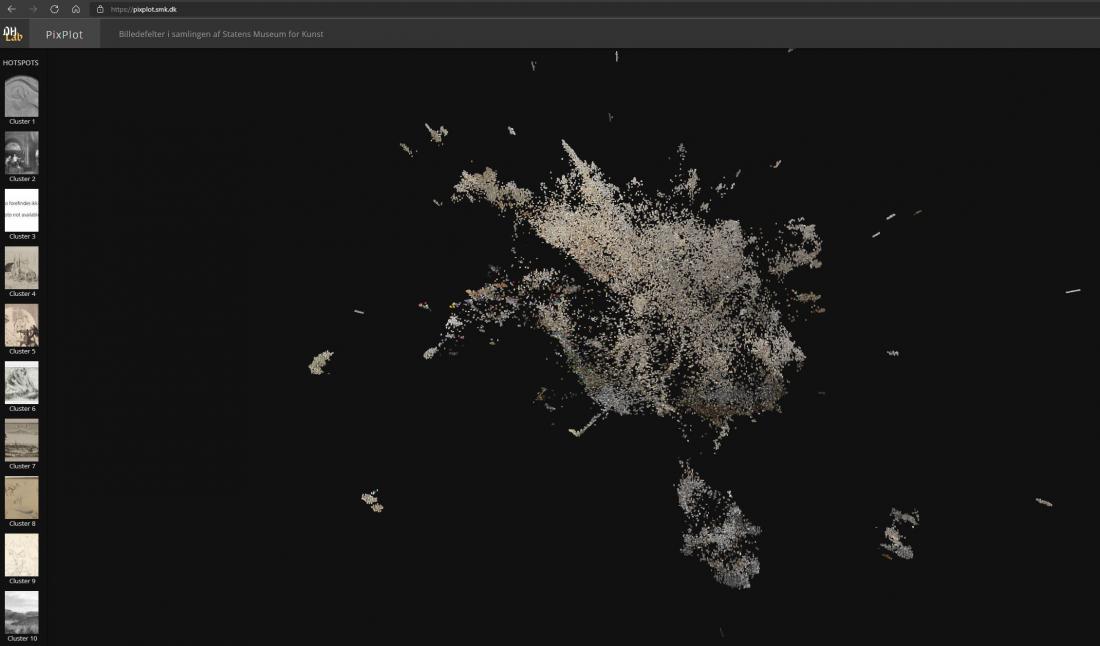
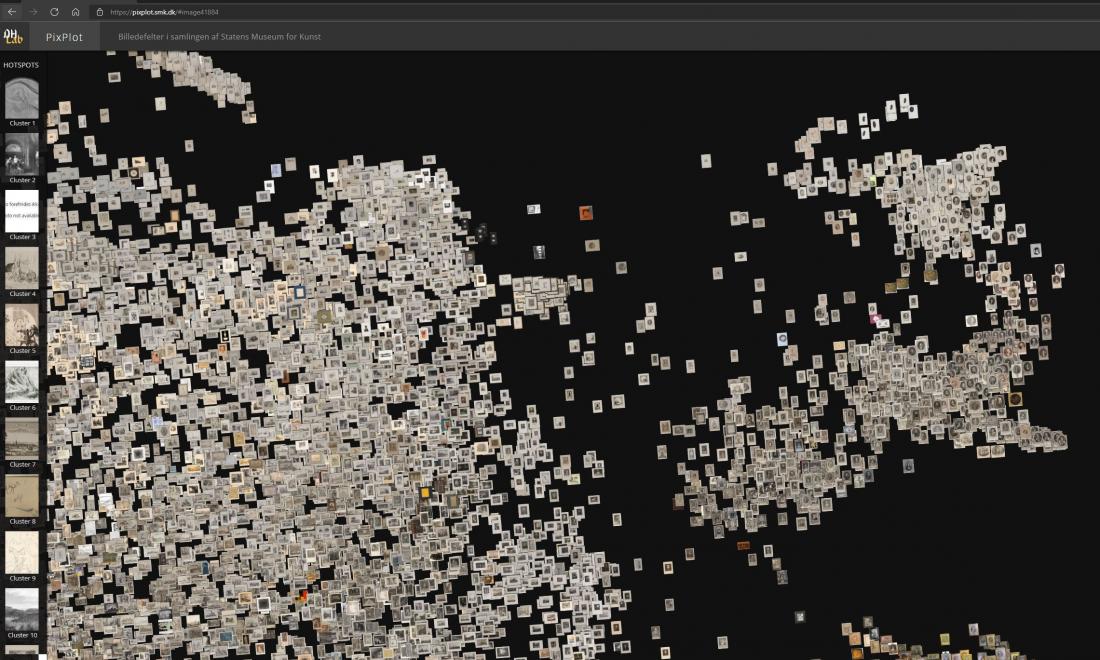
The data visualisation SMK – PixPlot as an object of visual analysis
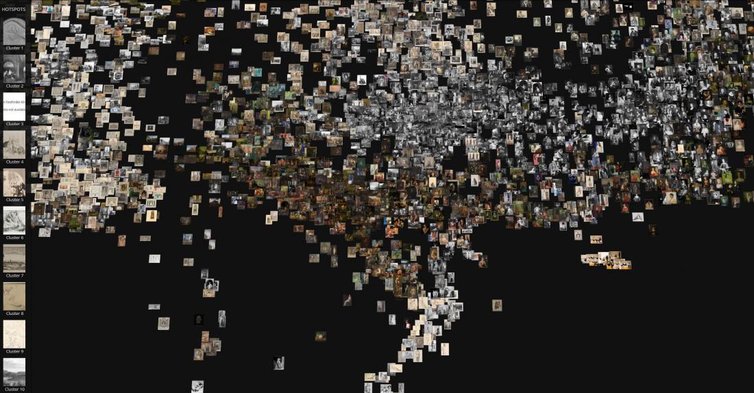
One of the fundamental skills of the art historian concerns visual analysis and the ability to interpret and contextualise visual phenomena. As an object of analysis, the PixPlot visualisation of photographs of artworks poses a challenge – what exactly can one say here? Resembling a cloud formed by images, the visualisation consists of thousands of photographs of artworks, each with their own visual idiom [Fig. 1]. The cloud consists of individual photographs placed near other photographs with which the computer has identified a degree of visual affinity. Whereas the individual photographs point back to a range of artistic intentions, contexts and messages in the original object, the image cloud instead is machine-produced, presented without explanation. It appears to be without intentions, and information on the choices behind the composition of the cloud is limited. What is more, technical errors in the coding may also affect the results, governing parts of the cloud’s figuration – and in such cases a computer specialist is required to see through the errors, both in the code and in the interface.
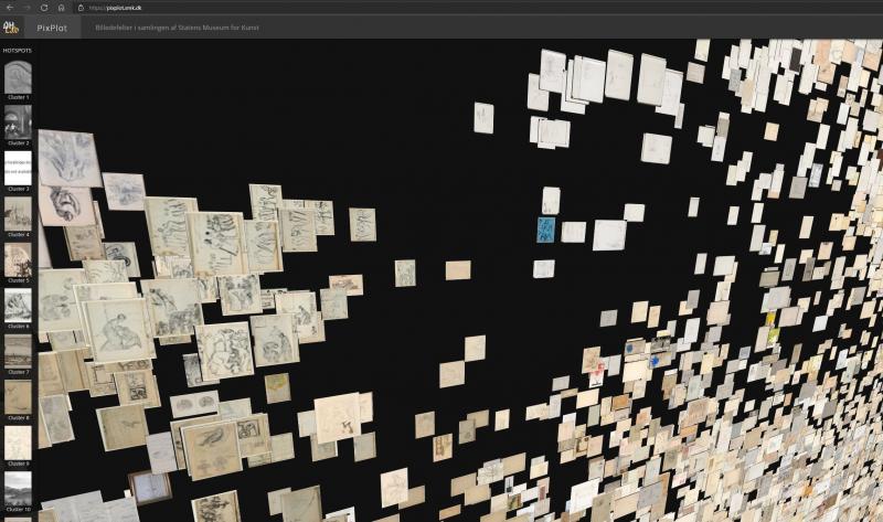
In PixPlot – SMK, the 40,000 photographs of artworks from the museum are reproduced as thumbnails in a cloud formation of shallow depth. The depth allows users to see the stacks in which images are arranged when the computer judges them to be very similar. The cloud condenses around a centre while a series of arms and islands extends from this centre of gravity. As was previously mentioned, the images are distributed in so-called clusters according to the algorithmic assessment of their visual relationships. These clusters are listed with a row of images on the left side of the interface, showing each cluster with an image selected by the computer as an ideal example. The individual clusters are numbered, but they do not automatically have any content description or a so-called label. This must be added manually.
The following sections on analysis present selected analytical angles that can be generally applied, and offer some suggestions on what should, at a minimum, be examined in this kind of macro-visualisation.30
Navigation
In our analysis of the image cloud, we tended to look for patterns and similarities between images, yet at the same time the things that stood out and seemed unusual caught our attention. As a consequence, we would take turns spotting what we have called transitions, outsiders and centres of gravity. It can be useful to be aware of which of these aspects one would like to investigate. It can also make sense to review and analyse the aforementioned series of clusters defined by the computer. By studying the characteristics of the reproductions of artworks and the relationships between them, signs of the computer’s actions – and the reasons for them – are also analysed.
During the analysis process, we began to form a sense of the composition of the image cloud, meaning that we gradually grew better at predicting in which cluster a particular photograph would be found. We verified this by selecting artefacts in the database and then trying to find them in the cloud. This was possible to achieve as long as the images were not part of the large, vaguely defined beige clusters. Here, studies of details would be required to find the similarities, but overall the computer often has more difficulty in analysing line drawings than, for example, painting. The overlap between photographs also makes it difficult to closely study the content of the individual clusters.31
Form, colour and black-and-white
SMK’s photo documentation comprises both black-and-white and colour photographs, and a large proportion of them depict works on paper in predominantly light beige shades. In the PixPlot experiment, we were interested in seeing whether the computer would make the simple move of doing an initial filtering by colour scale and black-and-white reproductions. That particular approach is evident in Yale’s PixPlot visualisation of a collection of primarily black-and-white photographs from the nineteenth century, where the cool grey and yellowish white tones of the photo paper proved decisive for how the computer sorted the material into two major clusters.32 This means that other possible relationships in the subgroups could theoretically be weighted as less significant, causing these traits to be split up on each side of the overall sorting. This may be unhelpful depending on the purpose of the visualisation. The basic tone of the paper may be a relevant filtering factor when studying issues of distribution or provenance. But the question is, then, whether PixPlot is sufficiently accurate as a tool. It may therefore be relevant to examine what weight seems to be given to the individual visual features and what consequences this may entail.
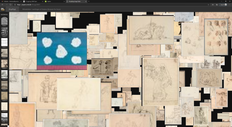
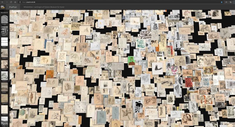
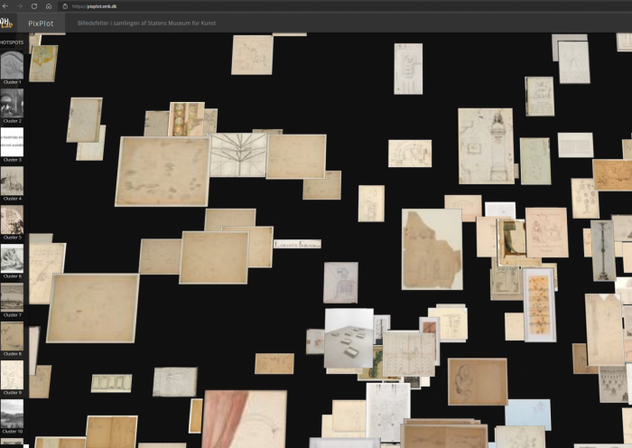
In the PixPlot visualisation of the SMK images, the light-coloured works on paper dominate, forming large, coherent clusters, but closer inspection reveals that the complexity and compositions of the diverse subjects depicted were just as crucial for the filtering process as the basic tonality of each photo. For example, a large cluster of paintings have been collated in the visualisation, even though they were depicted in both black-and-white and colour photographs. This suggests that the nature of the compositions rather than colour was a decisive factor in the computer’s analysis [Fig. 2]. There are several examples of brightly coloured artefacts standing out prominently from the surrounding light-coloured works on paper [Figs. 3a, 3b, 3c]. In those cases, perhaps the simple composition is responsible for the inclusion of the coloured image in the relevant cluster. In another example, it appears that a square shape in the image determines its placement rather than its colour and contrasts [Fig. 4]. This is to say that the Renaissance dispute between disegno and colore is repeated in the digital realm.
Looking at other examples of macro-visualisations of reproductions of artefacts in which colour plays a significant role, the Google Arts & Culture Experiment has conducted some of the most comprehensive projects. Using advanced machine learning, they have carried out two visualisation experiments with photographs of artworks, Curator Table and t-SNE Map, both involving a clear sorting by colour.33
In Curator Table, the images form a square containing an extensive hilly landscape, while the t-SNE visualisation has an open edge and a more uneven distribution. Both display the artworks in patches of similar hues. Up close, there are clear subgroups, such as jewellery photographed against a black background or blue-painted porcelain, clearly showing the importance of colour as a filtering parameter. On the other hand, it is difficult to see the reasoning behind some of the transitions between the various patches of colour. For example, it is often not clear whether there are visual connections in terms of subject matter or form between a cluster of dark images and an adjacent group of light images. Has the computer identified the two clusters separately, and is it just a coincidence that the two groups end up next to each other in the visualisation? Other transitions have obvious formal similarities; for example, one may can find circular shapes appearing across changes in colour.
Colour sorting can be helpful if you are looking for certain artworks – particularly if they feature bold, distinctive colours. In other cases, it would be more useful to be able to see structures across the colours, thereby dialling down the dominance of colour and give other visual features greater weight.34 In any case, it is often relevant to consider the relative weighting between form and colour when training your algorithms based on a specific purpose.
Frames
The perimeters between the artefact and its surroundings are typically marked by the frame and framing features such as passe-partouts, the shape of the artefact and border decorations, especially when it comes to artworks such as painting, drawing and prints. In art history, these features have often been perceived as being of secondary significance and value, while the weighty, meaning-bearing elements are to be found in the subject matter, which typically holds a central position. By contrast, a computer conducting a visual analysis is often more preoccupied with framing features than with what we regard as the main subject matter. For example, an oval format or a white passe-partout will often be the defining feature of a given image in the computer analysis, regardless of subject matter.
Thus, one of the tasks facing us today is not only to get the algorithms to recognise structures and patterns and filter the images by them, but also to make them ignore certain visual formal features that we might not be interested in filtering subjects by.
In this context, it should be added that in PixPlot – SMK, photographs of three-dimensional objects such as books and sculptures tend to appear in clusters with frame-like features, perhaps because the surroundings included in the photograph are interpreted as passe-partouts or frames [Fig. 5]. In other sections of the image cloud, the subject is given greater weight than clear framing features. For example, a portrait is placed in the portrait cluster even though its gold frame might just as well have delegated it to the group of images where the frame is the common feature regardless of subject. Elsewhere, a cluster of photographs of drawn portraits are grouped according to the common trait of being upside down. This prevents them from being grouped with related portraits that are turned the right way around. The example is a case of the computer not having been made aware of conventions which assist humans in their processing of images. If, on the other hand, you ask the computer to correct specific errors that have been found in the dataset, for example to remove gold frames that were not intended to be included, or to turn portraits around, it can – once the code is written – typically perform these task much faster and on a larger body of material than a human being can.
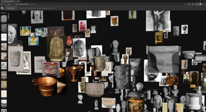
Three-dimensional artefacts
As we study the cloud of images, we come across a black-and-white photograph of a baptismal font. It reminds us that a photograph can itself be a work of art from the collection – or a means to register a given artwork. For the computer, there is no difference, and in several respects photographs of three-dimensional objects require greater care when used as data sets, especially if you wish to include them in purely visual computer analyses like this where metadata has no role. Artworks such as paintings and prints are also three-dimensional and material objects with many features that are omitted in photographs, such as their backs, edges and the shape of the surface, but the issue of omission is even more pronounced in artefacts such as sculptures or installations. Usually, such objects cannot be fully and adequately captured from just one angle. The setting of the work will often be included in the photograph, and the choice of angle, cropping and surroundings can radically change the formal features and composition of the image. It thus becomes unclear what the computer has in fact been asked to analyse as regard the image and the depicted work of art. If, on the other hand, one wanted to examine a particular style of photographing artworks and how it has changed over time, for example focusing on photographs of Bertel Thorvaldsen’s (1770–1844) sculptures, the task is so clearly defined that the computational visual analysis might well make sense.35 In such a case, the photograph itself and its formal logic becomes the focus of the analysis rather than the depicted work of art. This example illustrates how it is necessary to try out, but also to be inspired by the technological tools in order to adapt the tools and research questions in a process of mutual exchange.
In PixPlot – SMK, photographs of sculptures and installations are relatively frequently found among other artefacts with which they share certain similarities. One example is a photograph of the installation Eight-Part-Piece by Robert Smithson (1938–73), its light beige colours and geometric shapes resembling the works on paper that surround the photograph in the PixPlot visualisation [Fig. 6]. By contrast, a series of photographs of the installation Ritual II by Tonny Hørning (b. 1941), an installation reminiscent of a church interior, is judged to be so distinctive and particular that the computer ends up allocating them to an isolated cluster [Fig. 7]. This surprised us, as the photographs might – with their simple geometric shapes and brown-beige contrasts – just as well have been placed among the prints. One possible reason may be that the network was trained using images from ImageNet, which include churches and church interiors. As a result, the network may recognise similarities between the installation and this theme, prompting it to establish a separate cluster despite the visual similarities between the photo reproduction and the fine-art prints. If you needed to get the computer to distinguish between church interiors and gallery spaces, you could in principle train the network to do so with a training set where the visual differences between the two types of space are manually defined (supervised learning, see later). In carrying out such a task, one main issue would be whether the gallery space can be defined with sufficient visual clarity and distinctiveness to ensure that the definition would bring together installations and other three-dimensional objects, including the photographs of Hørning’s work. Whether it is possible establish a set of visual markers clear enough for the computer is one of the issues to be considered if you want to fine-tune a network to filter out images based on specific visual criteria. But this is also where the computer can potentially surprise us, for example by highlighting or linking artefacts in thought-provoking ways.
Outsiders
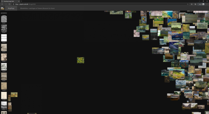
As the two examples provided above illustrate, outsiders can be found inside clusters or be isolated images placed far away from the others. Some outsiders can be truly puzzling. For example, the predominantly green painting Cosmic Landscape by Egill Jacobsen (1910–98) is placed entirely on its own next to a cluster of landscapes which it does not, according to the computer, sufficiently visually resemble to become a part of – although this does not mean that it ends up in one of the non-figurative clusters or is pulled close to other photographs of predominantly green artworks [Fig. 8]. Perhaps Jacobsen’s image is also similar to the arrangement of objects that constitute the closest cluster in the opposite direction. Might this indicate that in the computer’s analysis, this image is poised between two visual centres of gravity that pull in different directions, leaving it suspended on its own? Or is the image really so special that it should not have any close neighbours?
The outsiders, whether integrated or solitary, can sometimes be used by computer specialists to identify errors in the code. In other cases, outsiders can be used to train the network, nudging it in a specific direction and thereby acting as keys to adjusting the analysis process. By giving the system feedback on its choices, you can increase a specific kind of accuracy that is simultaneously defined by such feedback. You can always carry out the analysis again, change the composition of the cloud and promote nuances in the computational analysis. For example, a computer can be trained to recognise the style of a given artist, which could in principle enable it to group together their artworks in the cloud despite their differences in subject matter. In another type of task, algorithms have been trained to recognise structures in paintings by Frans Hals (c. 1582–1666), upon which the trained network has been used to detect areas in a selected painting in which hands other than Hals’s have contributed brushwork.36 Seen from this perspective, no categorisations are erroneous until one defines what is and is not an error. Once again, it is relevant to consider the similarities and differences between how humans and machines analyse the images. Similarly important is whether you want to guide the computer in a certain direction, such as to recognise a given style or a particular choice of subject matter – that is to say that it should learn to mimic human image recognition and traditional approaches to sorting and filtering images. Within the field of self-driving cars, a key effort is to have their navigational system mimic how humans recognise objects by feeding it images. Building on the connoisseurship tradition, various milestones have been reached by the so-called technical art history and conservation by supplementing the human ability to study similarities and differences in the visual and physical structures of the artefacts.37 If the computer could become an optimised analysis partner for art historians, this could have an impact on the methods and processes of art history as a discipline.
The question is, then, whether the more significant impact would be if the computer could challenge us and offer us alternative analyses of the material that might become relevant to us as human beings. For example, we might be able to obtain a new, relativized understanding of what visual affinities between images can be. Or we might find that hitherto unrecognised connections in our image culture become visible to us. Perhaps the reinforcing effects of the computer on embedded value judgments introduced with the training set might even highlight aspects of our culture that should be taken up for reassessment, for example subconscious visual expressions of misogyny or racism. Seen from another angle, computational work with images is also about how its various analyses feed off of and play into our society – often without the image becoming visible at all. To this end, artists have long worked with the social aspects of human/machine interaction and the opportunities in developing artefacts with aesthetic and critical agendas.38 In the context of this article, it could be that computational and algorithmic ways of working with cultural heritage documentation may in time affect and shift some of the fundamental hierarchies in art history: which artworks are most important to our culture? On what values are the judgments of art history based? What concepts of art or culture are applied by individual cultural institutions? Exploring this would also make it possible to render visible the constructed boundaries between visual/material culture and traditional art forms such as painting, drawing, sculpture and architecture.
A very simple factor here, already clearly evident in PixPlot – SMK, concerns how the computer can visualise and highlight artworks and groups of artefacts that otherwise receive little or no attention. Making greater use of such an approach to the collections and obtaining greater knowledge of the less frequently treated and recognised empirical data could potentially create a shift in the fields of interest and hierarchies found in art history. As we will discuss later, this is also about implicit and perhaps subconscious value judgments, an issue which is a major topic of discussion when considering the application of artificial intelligence in society in general.
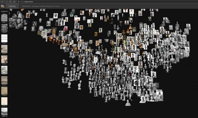
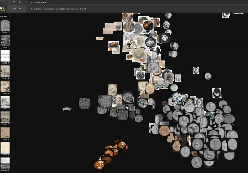 Fig. 9b. Screenshot of https://pixplot.smk.dk (20-12-2020).
Transitions and centres of gravity
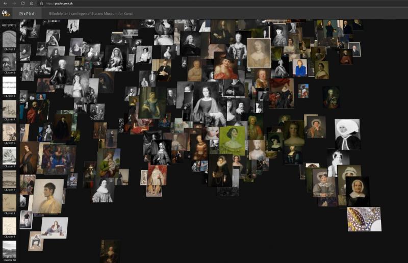
Another analytical perspective on the image cloud concerns identifying and examining centres of gravity and transitions between the clusters. Gravity centres comprising relatively similar images are to some extent defined by the clusters illustrated in the bar to the left of the interface (clusters 1 – 20), but many subgroups do not appear there. Busts and artefacts with a circular composition are very clearly gathered in separate clusters, but here the way in which the objects are photographed is also relatively uniform [Figs. 9a, 9b]. Some photographs of three-dimensional objects are also grouped together despite the very different formal qualities of the actual artefacts [Fig. 10].
The gradual transitions in the cloud may be relevant to study if one is working with large groups of very uniform material. It can provide useful impressions of variants of similar visual features and subject categories. In the large clusters of works on paper, for example, we found two transitions: one transitioned from a loose/restless drawing style to a more controlled, thinner line, while the other transition went from framed artefacts to artefacts with a white passe-partout. We also discovered other types of transitions governed by subject matter. One example concerns a transition from naked to clothed human bodies; another transitions from human bodies to images of carcasses and meat; and yet another concerns a shift in shades of colour between light-coloured, uniform photographs. In one place, a succession of portraits ended up in an image with no human figure but with a lace-like pattern [Fig. 11]. This may point back to the fact that the sitters in the portraits are dressed in various types of ruffles and lace. Here, the computer analysis may have been distilled out a single feature.
These examples involve easily recognisable motifs and formal features, and when one finds a centre of gravity – for example a cluster of images of mammals – one can also spot examples strewn around a centre of gravity, intertwined with other forms of subject matter. Here, however, it also becomes clear that you run the risk of seeing connections that may have arisen quite randomly rather than as a direct result of the computational analysis. All the clusters mentioned include exceptions and deviations from what one would typically see as the defining feature.39
Doubts and black box
In those cases where the clusters formed in PixPlot – SMK were too mixed for us to put our finger on any common features, a sense of doubt arose: are we reading too much into what we see as connections between artefacts that have been grouped together? Did what we see as connections arise randomly as outliers on the peripheries of adjacent centres of gravity? Do we overlook the visual similarities with which the computer actually works? At the same time, such nagging doubts can also spread to the observation of more obvious groupings where one was initially quite certain. For example, does the computer recognise that a given picture shows a horse, or do completely different features govern the choice to group the horse pictures in clusters? Such doubts arise out of the fact that our theories on which visual features the computer has used to defined individual clusters cannot be conclusively read from the visualisation – it contains no documentation for the individual choices. For example, it seems obvious that the computer has used the round shape as the defining feature when grouping photographs of coins, but it would require a major technical manoeuvre to confirm this. The algorithmic process is not yet fully transparent– some call it a black box, and in this respect one often resorts to educated guesses. Furthermore, the visualisation is also an interpretation on a technical level: the computer compresses its multidimensional comparisons of photographs of artworks to create a visualisation that can be displayed on a screen in a simulated three-dimensional format.40 As we describe later, the artefact is indeed reduced when converted into numerical values, but the individual pixels and their relationships are also analysed in completely different ways by computers than by the human eye.
Data visualisation as an iterative learning process
While working with PixPlot – SMK, we saw opportunities for 1) forming an overview of a very large quantity of image material; 2) contributing to critical thinking and reflection on image analysis and theory when computers are involved in the processes; 3) prompting fundamental discussions about methods, empirical evidence and theories found in the field of art history; and 4) considering consequences of non-human views of visual phenomena. Not all aspects can be covered here, but we will briefly say a few words about how the computer strengthens our awareness of processes, as we believe that efforts relating to this particular competence could strengthen art history as a discipline.
PixPlot – SMK was not developed to solve a specific task, and as yet we have not formulated any specific possible applications at SMK. Overall, the use of image clouds has not really taken off in the field of art history, but we still sense that visualisations such as PixPlot – SMK have potential in connection with learning and development processes in research, curation, teaching and dissemination.41
In purely practical terms, academics may need alternative ways of building charts and aides memoire of their empirical data and of illustrating the structures they see – or they may simply need the provocation offered by the computer analysis. Data visualisation can also be used as the starting point for developing new ideas – perhaps even in collaboration with others, where such visualisations can support communication and offer ways of illustrating one’s thoughts. In teaching, for example, the image cloud can be used to help students find and build narratives based on photographs of artworks. But the act of working with a data set and its visualisation also has its own cognitive effects and learning potential. This has been documented in a concrete teaching project where computer science students and art history students were brought together. They were to work on processing and visualising a data set on Renaissance humanists, and Elizabeth Honig et al. have summed up the experience as follows: ‘The shuttle back and forth between quantifiable data and humanistic inquiry through data and its visualisation was a hugely fruitful exercise’.42 The iterative processes yielded a special understanding of the data sets as well as of academic and technical requirements, and we derived some of the same lessons from working with PixPlot – SMK. From an art historian’s point of view, this provides a basis for entering into conversations with computer specialists on how computer analysis, data sets and visualisation might be further developed – or it can throw up ideas on how new data visualisations and research questions could be designed.
Our approach to establishing the image cloud was, thus, exploratory and aimed at reflection-in-action.43 Viewed in this light, the image cloud and other digital experiments need not constitute results in themselves: they can offer scope for reflection or constitute stepping stones for reaching new places.
Our next step is to add additional layers of information to PixPlot – SMK, such as metadata or broader contexts associated with the photographs of the artworks, ensuring that social and cultural dimensions are accessible in the analysis efforts.44 PixPlot – SMK will also be linked to data sets from other collections in order to follow the changes in the configurations of the visualisation. Doing so will offer a different way of studying and comparing the development of collections (for example collections in the Nordic countries), their constituents and the collection patterns. At the same time, we need to take a closer look at those clusters which have already yielded materials and connections that can be used in entirely different studies, for example on early modern depictions of natural objects.
The next challenge is that working with the computational results requires a degree of flexibility when interacting with any visualisations, and one may need to regularly adjust the computer analysis or data input. In this regard, art historians will often need to rely on professionals from other disciplines and on the completion of often time-consuming manual tasks, for example on rewriting code or digitising material. In the long term, we hope to see the arrival of user-friendly software that enables users to upload their image material and have macro-visualisations of various kinds generated – without the need for any coding skills.
Digital art history is poised between several professional disciplines, and if one wants to get involved in the field, it is necessary to – at least partly – learn the specific professional terminology associated with computer science and the digital humanities. Digital art history projects often involve several disciplines, and the various participants need to communicate about goals, process and results.45 Accordingly, the following sections address some technical concepts relevant to anyone wishing to understand the computer’s visual analysis. Along the way, points from the work with PixPlot – SMK and other relevant projects with art historical aspects are raised.
The computer as beginner: Learning process
Artificial intelligence (AI) is about making the computer mimic (and surpass) human cognitive processes and reasoning, for example when playing chess or engaging in dialogues. Basically, artificial intelligence consists of algorithms, meaning sequences of code that describe a series of computational operations capable of processing a dataset or performing some task. These algorithms can be built in so-called artificial neural networks – a term inspired by descriptions of the biological processes in the brain. The analysis process takes place in layers of neurons, each of which assesses the input based on different properties. These deeper networks (known as convolutional or deep neural networks) are increasingly able to deal with complex issues and find subtle patterns not noticed in human analysis.46 For reasons of clarity we only employ the terms computer and algorithms here, as artificial intelligence is a major field with many application areas and sub-domains, including machine learning and deep learning.47
Computers have long been able to carry out clearly defined tasks, such as ‘Set the building alarm to go off at 7 p.m.’, but today many experts are concerned with utilising the ability of certain algorithms to learn from data input and feedback from humans. In other words, the computer can identify structures in the data material and go on from there to set up hypotheses or rules. For example, it will be able to suggest a suitable time for turning the alarm on based on the data provided about activities in the building. As far as images are concerned, algorithms can learn to recognise a human face by analysing a large number of images – instead of giving the computer a complete set of rules for what a face looks like. In this way, the computer establishes its own criteria for when the category ‘face’ is in a given image or not, and it will gradually get better at it the more examples it is fed. This ability to learn through experience makes it easier to adjust skills of a computer and transfer what it has learned to other domains and situations. You do not need to repeatedly re-establish rules to cover every conceivable situation.48
In this regard it is important to understand the difference between whether the algorithm’s learning process is supervised or unsupervised – a distinction which says something about how humans are involved in the process.
Training with or without supervision
Before a computer can work with an unknown data set, it needs to be fed training data to learn to recognise, group and define different types of, for example, images. In other words, algorithms are trained by means of a large selection of examples similar to the unknown material they will later be asked to handle – they are pre-trained. In doing so, you train and create a model that can subsequently be used on a new data set. Since it often takes many thousands of images before the algorithms have learned enough to be able to recognise new examples, the available stores of art historical material often fall short. Therefore, you will typically need to use algorithms that have been trained by means of photographs of all sorts of things, so-called natural images, meaning that the algorithms are only to a lesser degree trained on the basis of photo documentation of art and cultural artefacts from the archives of museums.49 What is more, human beings have determined what the training data set contains and how the labels of the individual picture elements are defined: humans have come up with the designations manually attached to each image in the relevant data set. This is the first opportunity for bias to assert itself and affect the process.50
When a computer is asked to classify an image of, for example, an animal, its response will typically be given as a percentage. The computer might state that a given image is with 80% certainty a picture of a dog, but also the likelihood of it being a camel is 20%. In supervised training, the computer receives directions on positive and negative results using definitions or labels given to it by humans. If a network is to learn to determine whether a given image shows a golden retriever or not, it must first come across a lot of annotated images of dogs and other similar shapes. If the network has never come across a cat before, meaning that it never learned to distinguish between the various characteristics of dogs and cats, the computer may well believe that an image of a yellow cat shows a golden retriever. Such examples will respond to common features such as colour, ears, fur texture, eyes, snout, etc. If you then inform the computer that the cat picture is not a positive result, this will contribute to the computer eventually learning to make this particular distinction between yellow cats and retriever dogs.51
If, for example, you want an algorithm to identify who designed a tea set shown in a given picture, but the network is only trained on pictures of jungle animals, the task has been incorrectly set. The answer would probably be that the tea set is a rated, weighted mixture of various animal species with traits similar to the tea set’s colour combinations and shapes. Here it becomes clear that the choice of training material and the labels given govern which tasks the algorithms will be able to solve. Applying this train of thought to art historical material – a realm where ambiguity, abstraction and dialectical relations between part and whole can govern the formation of meaning and opinion – it becomes clear that as a professional working in the field, you will make choices that will affect and shape the model and its applicability – or lack thereof.
When the learning process is not supervised, the computer instead forms groupings out of the data set based on structures it finds itself – this is known as clustering. You might say that the computer offers its own take on which rules apply to the data set instead of sorting the data inputs into predefined boxes such as dog, cat, camel, etc. – which is known as classification. The unnamed clusters form the basis for a data visualisation in which the computer presents its results.
In the specific case addressed in this article, the algorithms have analysed SMK’s collection in an unsupervised manner, meaning that the computer has not been fed any fixed categories to serve as a basis for its work. It finds, so to speak, its own patterns in the material, establishing clusters based on its analyses. However, as has been said before, the computer has previous experience from a training set of photographs, meaning that it is to be expected that artefacts featuring specific subjects – such as horses or faces – will be collected in clusters in the visualisation. This is to say that clear iconographic groupings arise – although these may, as has previously been described, include some surprising, unexpected takes on where a specific image should be put.
The importance of training data
The impact of training data on the performance of an algorithm can be illustrated with a famous example where a computer was rendered able to distinguish between pictures of huskies and wolves. The results were very successful, but it was the snow in the background of the wolf images that proved decisive for the computer’s conclusions.52 This example will be old before the day is out, but the point remains relevant: the computer seems to be affected by the data set it was trained on; and it creates categories on the basis of visual similarities in ways different from what we would typically do. Exactly what the algorithms have been trained to determine – and the material supplied to them in order to build experience – is crucially important.
Similarities and differences between the training data and the data set you want the computer to analyse also affect what you can use its analytical skills for in digital art history. Today, the algorithms used have typically been trained to recognise and categorise images on the basis of millions of photographs of the world around us taken from the well-known data set ImageNet.53 However, art history projects that involve computational visual analysis typically ask the computer to analyse photographs of artworks – and such images operate differently than photographs of the world. An enduring question in this regard concerns how one may train and adapt the algorithms to make them more useful and more accurate when applied to pictures of artworks.
The image as numbers
Although the computer analyses images and identifies image elements, it ‘sees’ nothing. Rather, it works with numbers that define the properties of each pixel. The process is essentially different from the way in which we humans look at images, so in the following we will briefly describe its analysis process.
The fact that digital images technically consist of numbers is another reason why we call the digital reproductions ‘reduced artefacts’. Digital photographs appear to us as images on the screen, but the computer works with them as numbers that define the properties of each individual pixel in the image. Furthermore, numbers are used to define a range of storage options.54 One way to gain insight into how algorithms analyse images is to visualise and study ‘cross sections’ of the layers involved in the analysis process. This is known as feature visualisation.55 Neural networks consist of neurons, which respond to different elements in the image that are mediated by individual pixels being activated or not. Each neuron carries a specific weight, and they each respond to different ‘features’, meaning the visual traits formed the individual pixel and its nearest neighbouring pixels. These may include colours, edges, contrasts, rounded shapes, wavy lines etc. The network has acquired and trained this skill by means of training data. In other words, the computer does not ‘see’ the image but registers only pixels and their properties as defined by numbers. The computational visual analysis is thus based on numbers, meaning that the process does not have a visual dimension in the same sense as human perception does. This also means that feature visualisations offer a kind interpretation of what is going on – they are not ‘stills’. These visualisations often consist of partially abstract elements and partially recognisable elements of the total image, illustrating some of the features that provided decisive for the assessment of a given image. Perhaps the computer identifies a striped pattern formed by an interface between pixels in white and red-black and rightly concludes that it is a baseball. But this means that the computer defines the ball in relation to the pixel pattern formed by its seams, not in its entirety as a figure against a ground.56 Alternatively, the computer might use elements around the ball – such as the background colour, as in the wolf/dog example – to identify the appearances of baseball. The computer thus works its way systematically through sets or sections of interrelations in the image data, seeking to identify features that can be grouped together to form a common classification. These computer skills will presumably see extensive changes in the coming years.
The feature visualisations illustrate how the algorithms work with subsets and relationships between smaller units in the relevant image. This way of perceiving images is very different from the human eye, in which figurations and effects are formed in an ongoing interplay between physical perception and the brain’s interpretation of the impulses.57 To this we may add the well-established lesson learned in reception aesthetics: that the presuppositions of the observer, – their background, culture and so on – affect the sensory experience of pictorial elements and how they are interpreted. This means that the visual tricks and devices used for millennia to influence the perceptual process and deceive the eye do not work in the same way in computer visual analysis.58 For example, a human being may perceive two fields of colour as vastly different because adjacent colours affect how they see them, even though the computer recognises them as pixels of the exact same colour. In art, the eye is often deceived in order to heighten a sense of space, depth, relative size, tension, light and so on. These tricks are not detected in the same way by the computer, and it can also struggle to assess ambivalent representations. Such ambivalence may involve ambiguous spatial depths or shift in a semantic sense depending on how one identifies the individual parts and their interactions. While human beings will often easily recognise a given subject as a ‘sad man’ or respond to a harmonious mood in an abstract composition, enabling them to group and co-create such images based on their personal experience, the computer does not have an emotional register for art to tap into. The computer is limited to the categories we give it or which it itself forms from the material. But this also means that it is not (certainly not in the same way) affected by the man’s sad eyes or by notions about abstract art being boring.
Visual analysis
The fact that computer analysis differs greatly from human analysis raises a number of questions when one wants to use computational image analysis skills for art historical purposes. Can one find relevant uses for its accurate measurement of pixels, their extent and properties? When are we influenced by illusions and tricks that do not affect the computer – and, conversely, which visual phenomena are difficult for the computer to handle? And can these ways of comparing patterns in pixel groupings and compositions illustrate similarities or related features that are beyond the capabilities of human perception? Fundamentally, one may also still well ask which kind of visual structures capture the attention of the computer. In this regard, it turns out that not only simple features such as picture frames dominate the computational assessment: the computer has visual preferences too; for example, texture is a more dominant factor than form in its classifications.59
In 2018, art historian Peter Bell and computer specialist Björn Ommer identified five areas where computers are attached to art-historical visual analysis: 1) searches for duplicate artefacts; 2) semantic comparisons of image elements on the basis of object detection, i.e. identification of image elements; 3) assessments of differences between similar artefacts by means of calculations; 4) style analysis and 5) analysis of similarities in large quantities of images.60 In this article, we have presented an example of the fifth type of visual analysis, but one can follow the trail of digital experiments in each of these areas, all in different stages of development. Visual analysis as a method has other layers, too. For example, challenges may arise in the interaction between visual and non-visual aspects of an artwork or in the internal process of the computer – challenges which may in time be added to this list. As previously described, there are several reasons why translating the human image analysis to the computer is far from straightforward. Therefore, we conclude by bringing forth a few comments on object detection, as this process is also about the value-laden relationship between image and word that art history has worked on for centuries.
Object detection: Word and image
Artists and activists around the world challenge the ‘gaze’ of the computer by cheating visual surveillance systems in various ways. Paradoxically, such probing of the limits of various systems can in fact contribute to improving their performance. Face recognition is one example. Object detection systems are used commercially in many contexts, but they also constitute the computer’s answer to iconographic analysis in which image elements are identified. That task involves attaching descriptions to images and classifying them correctly. In the field of art history, the greatest progress has been made in making computers recognise the iconography of Christian culture, which has a clear textual frame of reference and is a fundamental part of the classification system Iconclass. But when working with many other artistic modes of expression and subjects the results still vary in terms of quality. Potentially, there is much to be gained from the use of object detection, but defining the possible links between words and images requires a good digitisation process and often a lot of work. In art, the designations of form and image elements can be unstable and indefinable – even intentionally polyvalent – and may not even have a mimetic frame of reference.
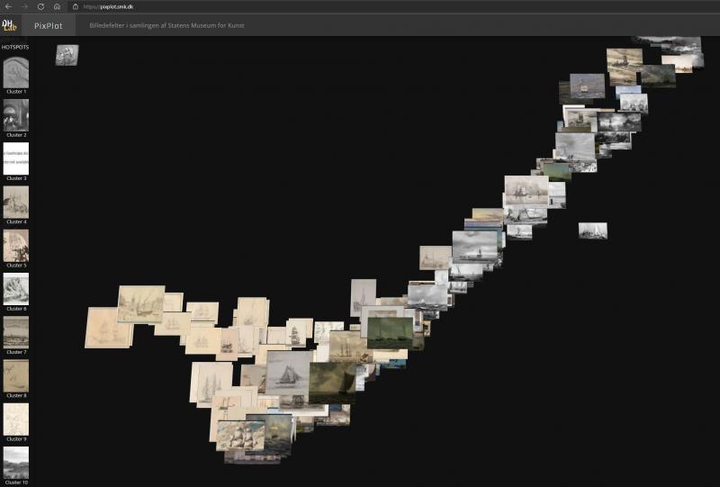
As has been pointed out, individual picture elements can interact, causing them to appear to us with different meaning and significance. In other words, there is not always a single right answer when computers need to be guided on whether its assessments and classifications are accurate. The problem is fundamentally not technical in nature, but rather springs from the fact that semantic annotation of images is not a neutral, objective process. In her dissertation on the production of digital timelines, Olivia Vane relates a point raised in an interview with a museum employee. The interviewee reported that in the past, the institution mostly received inquiries about artefacts by artist names, while today the inquiries more often centre on themes, such as ‘feminism’ or ‘Black history’.61 Such topics will typically appear less frequently in older indexing and may also require more work to identify compared to, for example, artefacts with maritime subject matter, where the computer can easily identify the right images [Fig. 12].
Alina Kühnl raises the same criticism in her article on inherent racism in Iconclass, and in the same thread, Iconclass editor Hans Brandhorst points out that if Iconclass is to retain its relevance, the categories and classification must be continuously revised.62 The changing needs for points of entry to the artefacts indicate that as a discipline, art history needs flexible annotation tools that do not exclusively depend on manual (and thus costly) labour. The preferred solution would instead be automated so that current or future needs for access to documentation and registration of visual aspects can, by means of key terms and subject indexing, keep up with the growing amount of documentation of artefacts.
Perspectives
Centres and departments for digital humanities are becoming increasingly widespread at universities today. Digital humanities scholars Sander Münster and Melissa Terras argue for the establishment of ‘visual digital humanities’ to highlight the need for special efforts in relation to the visual aspects.63 At the same time, there are signs suggesting that several aspects of art history scholarship can be unfolded in interaction with digital methods and tools, furthering research in terms of historical investigations, interdisciplinary ventures and theoretical studies. The steadily growing quantities of digital images of art and cultural artefacts in the form of documentation, artistic adaptations and computer-based data visualisations offer by turns familiar and all-new material for art historians to explore and process. The sheer scope of such material alone stimulates the need for involving the computer and its ability to process the large amounts of data. In order for the computer to be incorporated in curation, dissemination or research in effective and well-considered ways, it is also important that professionals such as art historians clearly state what their specific discipline needs. In particular, this entails providing feedback on the development of digital tools (including unfinished ones), their functionalities and limitations. Likewise, it is relevant to consider how other disciplines in any case interact directly with core art historical activities such as visual analysis.
In summary, it can be said that the previously mentioned ‘potentially transformative effect’ may involve the digital methods and tools contributing to the following: 1) Expanding the scope of art history’s field of study in the form of data visualisations and a larger production of visual documentation associated with art and culture, 2) giving new, topical relevance to visual analysis and discussions about the human eye versus the gaze of the machine, 3) increasing our understanding of processes – and our reflections on them, 4) increasing the scope and quality of collaboration and facilitating a greater degree of team-based research, and 5) supporting interdisciplinary collaborations
These perspectives shift the focus away from the discussion of whether digital technology can take over and replace analogue working processes in the field of art history. Instead, they point to changes and expectations currently taking place and finding expression in the humanities and in society. While far from all art history research lends itself well to having a digital element integrated, cultural changes to the overall landscape of research may in the long term have an impact on art history as a discipline: its repertoire of methods, stock of visual empirical material and self-understanding.64 These changes may mean that as an art historian, one needs to invest more time and energy in making and sharing process papers, regardless of whether your current task involves digital elements or not. Another aspect concerns cultivating the ability to recognise data sets in art historical material which can fruitfully be processed by the computer or be used in interaction with other disciplines and their endeavours. Yet another concerns knowing where and when to be critical about the use of computer-based methods. All this requires us to build an understanding of what standards and requirements the datasets must meet. We must also systematically gather and activate lessons learnt in terms of how to establish a workflow that cuts across several disciplines. Not least, we should be vigilant and show imagination in striving to identify issues that may have great relevance for the field of art history, and where one can also involve the competencies of other disciplines to strengthen the final solution. The challenge here is to strike a balance between the disciplines involved, as the work done by one research field can all too easily come to act as an auxiliary discipline for the other.
Notes
About the author